Building usable and accessible diagrams with React Flow
Learn how to build interactive, accessible, and intuitive diagrams using React Flow. Explore key UX challenges and practical solutions for creating diagramming tools that are both powerful and inclusive for all users.


Accessible Diagrams with React Flow
Diagrams are a powerful way to visualize data and processes. They help users quickly understand complex structures and relationships. Modern apps use diagram-based interfaces in everything from workflow tools to automation platforms and data modeling. However, just showing information visually doesn’t guarantee a good experience. To make diagrams truly effective, you need strong UX – intuitive, accessible, and usable by everyone.
React Flow is one of the most popular libraries for building interactive diagrams in web apps. It’s flexible and packed with useful features. Moreover, designing with users in mind takes more than just using the tool. It means solving lots of UX challenges around layout, interaction, and accessibility – especially if you want to meet WCAG standards.
What is WCAG?
WCAG stands for Web Content Accessibility Guidelines. It's a global standard that helps make websites and apps easier to use for people with disabilities – like vision loss, limited mobility, or cognitive challenges.
Version 2.1 sets clear rules for keyboard navigation, screen reader support, and color contrast. Following WCAG 2.1 isn’t just about following the law – it helps you build more usable and inclusive products.
Accessibility (a11y) and keyboard navigation
Interactive diagrams play a key role in visualizing complex processes and relationships – especially in automation systems, data analysis tools, software engineering platforms, and industrial SCADA systems. But because diagrams are dynamic and mostly visual, they can be hard to use for people who rely on assistive technologies like screen readers – or for users with limited mobility who navigate by keyboard instead of a mouse.
What is a11y?
A11y is short for accessibility – the number 11 replaces the eleven letters between ‘a’ and ‘y’. In tech, accessibility means making sure digital products can be used by everyone, including people with disabilities.
A11y is the general concept – WCAG is the rulebook.
Put simply: a11y is the goal, WCAG is how you measure it.
Challenges faced by users with limited mobility
React Flow is one of the leading libraries for building diagram interfaces in the React ecosystem. It includes basic keyboard navigation and partial ARIA support. Full accessibility depends on how the app itself is built – especially when it comes to node content. Since nodes are usually custom React components, they need to be made accessible individually.
What is ARIA?
ARIA stands for Accessible Rich Internet Applications. It’s a set of special HTML attributes that make web content easier to understand for screen readers and other assistive technologies. These attributes help define what a button, dropdown, or diagram node does – even if it’s built with custom code.
ARIA is part of a larger spec called WAI-ARIA, created by the Web Accessibility Initiative (WAI). WAI-ARIA is focused on making modern, interactive web apps more accessible.
You can think of it this way: ARIA fills in the gaps when regular HTML isn’t enough – especially in apps that use React or dynamic interfaces.
One of the main challenges is the lack of a universal standard for keyboard navigation in diagrams. It largely depends on how the diagram is used. In some cases, users tab through elements as if navigating a form. In others, the diagram is treated like a grid, following WAI-ARIA practices. Because of that, the default navigation model in React Flow is often insufficient for apps with more advanced accessibility needs.
Digital accessibility is no longer just a best practice. In many regions, it's required by law. While most legal standards are based on WCAG, each country may apply its own interpretation or additional rules.
What they all have in common is the focus on users with limited mobility – people who can’t easily use a mouse and rely on keyboard input instead. These guidelines highlight the need for fully functional keyboard interfaces, with logical tab order, visible focus states, and intuitive shortcuts. The Home Office Design System is a great resource here, offering practical examples and implementation tips.
It’s also important to remember that keyboard accessibility isn’t just for people with disabilities. Many users – like developers – simply prefer using a keyboard because it’s faster and fits the way they work.

Visual perception challenges and screen readers
Blind and low-vision users rely on screen readers, which turn visual content into linear, text-based information. Standard diagrams built with SVG or HTML elements can be detected by screen readers, but without proper semantic labels, their structure and meaning are often lost. This creates serious barriers to understanding how elements in a diagram relate to each other.
Common accessibility issues in React Flow diagrams:
No logical focus order – Keyboard users can’t move through diagram elements in a way that reflects the information flow.
Missing ARIA descriptions – Screen readers can’t interpret nodes and edges as a connected structure.
Complex navigation – There’s no alternative way to explore the diagram as text – for example, as a table or hierarchical list.
A study Understanding Screen-Reader Users’ Experiences with Online Data Visualizations found that screen reader users interpret data visualizations with 61.48% less accuracy compared to sighted users. They also spend 211% more time interacting with charts – a clear sign that current tools aren't built with them in mind.
Strategies for improving accessibility in React Flow
To make diagrams more accessible and WCAG 2.1 compliant, it's important to focus on three key strategies:
1. Full keyboard support – enabling logical navigation across nodes and edges
Keyboard accessibility should be based on logical and predictable navigation that allows the user to move between diagram elements consistently.
UX principles for keyboard navigation:
Focus visibility on interactive elements – Users should always know where they are within the diagram and which element is currently selected. This requires clearly designed ‘focus states’ that consider possible visual impairments, e.g., difficulty distinguishing colors or differences between them.
Logical tab order that matches data flow – Users should be able to move through diagram elements in a way that reflects the diagram’s layout, e.g., left to right in a process diagram.
Keyboard-controlled interactions – Users should be able to edit, move, connect, and delete nodes using intuitive keyboard shortcuts. These shortcuts should be easy to access, compatible with screen readers, and not interfere with regular app usage.
Despite improvements in user interface accessibility, most modern diagramming and flowchart tools still don’t offer full keyboard-only control. Apps like Whimsical, Miro, Lucidchart, and many others support a wide range of keyboard shortcuts for adding and connecting elements and basic navigation. However, they still fall short when it comes to fully managing diagram creation and editing without a mouse.
For example, users can usually insert nodes and move between them using the keyboard, but advanced actions – like opening context menus, selecting custom shapes, or managing relationships between elements – often require a pointer. These limitations not only reduce efficiency for users who prefer keyboard navigation but also create serious accessibility barriers for people with motor impairments. That’s why keyboard support in diagramming tools needs to go further – enabling full control over creation, editing, and navigation without relying solely on a mouse.
2. Semantic ARIA labels – improving diagram readability for assistive technologies
To help screen reader users understand the structure of a diagram, it’s essential to define what each element means and how everything is connected.
UX principles for using ARIA in diagrams:
Each node should have a unique ARIA label – e.g., ‘Node A1: Data processing, connected to Start node.’
Connections should be interpreted as relationships – e.g., ‘Connection: Start → Processing → End.’
Group nodes into logical sections – Use ARIA roles to improve how screen readers interpret its structure, e.g.,
role="application", role="list", role="tree")
There’s a well-known saying in accessibility: ‘No ARIA is better than bad ARIA.’
Multiple reports and studies prove that websites are becoming more complex – and the number of accessibility errors is growing. Although ARIA has the potential to improve accessibility, incorrect implementation can actually cause more issues than not using it at all. This highlights the importance of developer education and the use of native HTML elements wherever possible.
One statistic from The WebAIM Million 2024 report reveals that researchers found an average of 89,050,856 ARIA attributes – that’s 89 per page! ARIA usage increased by 15% in just one year and has grown more than fourfold since 2019.
This graph shows the number of ARIA attributes per homepage over time:

The report indicated that 74.6% of one million analyzed homepages utilized ARIA.
Pages that included ARIA had, on average, 34.2% more accessibility errors compared to those that didn’t.
The increased use of ARIA was directly linked to more issues being detected. The more ARIA attributes a page had, the more accessibility problems were found.
This doesn't mean that ARIA itself causes errors; it's the poor implementation that can easily backfire and create barriers instead of removing them.
What’s more important than adding ARIA is using proper semantic HTML tags whenever possible. ARIA should only be used when there's no native HTML alternative – for example, when displaying real-time data or notifying users about events happening elsewhere in a diagram.
3. Alternative ways to interpret a diagram – giving users access to structured data by lists or text hierarchy
Because diagrams are primarily relational structures, it’s important to offer users alternative ways to explore them – ways that don’t rely on visuals alone. This allows people to understand relationships between elements even if they can’t see or interact with the graphical layout.
UX approach to alternative diagram views:
A list or table view of nodes and connections – Enables users to scan the diagram’s structure in a hierarchical or sequence format.
Flexible layout options – The diagram layout should match the types of relationships between elements. Users should be able to switch between preset layouts to better meet their needs and analysis context.
Exporting the diagram structure to accessible formats (e.g., JSON, CSV) – Allows assistive tools to process the diagram in a more structured, readable way.
One of the best-known examples of this approach is IBM Carbon Charts, which combines interactive visuals with full access to data in table form, text descriptions, and code.

Drag-and-drop UX in React Flow diagrams
Drag-and-drop is a core interaction mechanism in diagrams built with React Flow. It allows users to freely position elements, reorganize the structure, and dynamically build flows. However, this type of interaction presents several UX challenges – especially when it comes to touch devices, precise placement, and visual clarity.
UX issues with drag-and-drop interactions
While drag-and-drop feels intuitive for desktop users, its implementation can cause frustration and interaction errors in other scenarios:
Poor performance on mobile devices – Touch gestures work differently than mouse interactions. This often leads to accidental node movements or unintentional drops.
Lack of visual feedback while dragging – Users can’t clearly see where a node will land, which causes placement errors and requires repeated adjustments.
Difficulty with precise positioning – Without helper features like a snap-to-grid system, diagrams can become messy, with poorly aligned nodes and unclear connections.
Strategies for improving drag-and-drop UX
To ensure smooth and predictable interactions, consider implementing the following solutions:
1. Optimizing interactions across different devices
Drag-and-drop should reflect the way how users interact with interfaces, depending on their device:
Mouse (desktop/laptop) – Standard drag-and-drop with click-and-hold behavior.
Touchscreens (smartphones/tablets) – Support for tap-and-drag and long-press gestures.
Keyboard (desktop) – Selecting an object using a shortcut, then placing it on the canvas either automatically or with arrow key positioning.
It's also important to test the drag-and-dropexperience under different real-world conditions:
Testing on screens with various resolutions – To avoid issues caused by imprecise drag gestures.
Checking interaction in different orientations – Both horizontal and vertical modes, especially on tablets.
Handling edge cases – Making sure the system responds well to fast drag movements, interrupted gestures, or interactions near screen edges.
According to the W3C Web Accessibility Initiative (WAI), many users can’t perform precise drag actions. Instead, they rely on alternative input devices such as trackballs, head pointers, eye-tracking systems, or speech-controlled mouse emulators. These tools often make drag-and-drop interactions frustrating or error-prone – which is why proper support is essential.
2. Adding visual feedback
Clear visual feedback significantly improves user comfort:
Highlight the drop target – e.g., by changing the background color of the area where a node will be placed.
Ghost preview of the dragged element – A transparent version of the node that follows the pointer helps users stay oriented in the diagram.
Display alignment guides – Show when a dragged node lines up with other elements, making it easier to position things precisely.
3. Improving precision with snap-to-grid functionality
One of the most common UX issues in diagram tools is misaligned node placement. When users position elements freely without visual constraints, the layout can quickly become chaotic and difficult to read. Using a snap-to-grid system helps maintain structure and clarity, making it easier than a free-hand workspace.
Good practices for grid snapping:
Adjustable grid density – Users should be able to choose the level of precision (e.g., 10px, 20px).
Temporary grid override – Allow disabling snapping by holding a modifier key like Shift.
Highlighting active snap points – Visually show where the node will land as it’s dragged.
Benefits of using snap-to-grid:
Better diagram readability – Evenly spaced nodes make it easier to understand the relationships between elements.
Fewer accidental misplacements – Users have more control over how nodes are positioned.
Visual consistency – Aligned elements give the diagram a clean and organized look.
Styling and visual customization
Interactive diagrams are key to visualizing processes, systems, and data flows. Their appearance – and how well they align with the app’s design system – directly affects readability, usability, and how users perceive the brand. React Flow’s default styling is functional, but it may not meet the visual standards of every application, which often makes customization necessary.
Visual design isn’t just about aesthetics – for 52% of users, it’s a deciding factor in whether they return to a product. A polished and cohesive look builds trust, strengthens user experience, and improves retention. Neglecting this area can be costly: 94% of users say they don’t trust websites with outdated or inconsistent designs. That’s why modern, visually consistent diagrams are critical to earning and keeping user trust.

React Flow customization challenges
React Flow offers broad customization options for nodes and edges. However, many teams still struggle to integrate these elements with their own UI and UX systems.
Styling in React Flow is based on standard React techniques, which means you can apply common approaches to manage styles and components.
The key difference lies in how React Flow handles zooming. When users zoom in/out, the library scales the entire canvas using transform: scale. This can interfere with certain animations – such as the ripple effect from Material UI (MUI) – because scale transforms can disrupt timing or positioning. As a result, teams often need to adjust their interaction design to account for these limitations.
Common customization issues
Default styles feel too technical – The out-of-the-box look for nodes and edges doesn’t always align with the app’s branding or visual identity.
Scaling visual consistency is hard – Without a centralized styling system, it’s difficult to manage consistent styles across large, component-heavy apps.
Limited support for dynamic themes – Many organizations rely on dark/light modes or branded color palettes, requiring styles that can adapt easily at runtime.
Strategies for improving React Flow customization
To align diagram visuals with your product design, it’s worth applying these key UX strategies:
1. Customize nodes and edges using nodeTypes and edgeTypes
React Flow lets you fully customize visuals by defining your own nodeTypes and edgeTypes. This gives you full control over how nodes and connections look, behave, and respond to user input.
UX recommendations for custom nodes and egdes:
Use visual hierarchy – Highlight important nodes with distinctive colors or styles (e.g., decision points in business processes).
Apply consistent edge styles – Different types of relationships (like data flow vs. dependencies) should have clearly differentiated lines: solid, dashed, arrowed, etc.
Add icons and labels – Visual cues like icons or node labels make diagrams easier to scan and more accessible to users with cognitive or visual impairments.

Example:
For inspiration, take a look at how FigJam (Figma’s flow diagram tool) uses custom nodes with predefined styles to keep everything visually consistent across the app’s UI.
2. Using design systems and design tokens for consistent styling
One of the biggest challenges when styling React Flow is maintaining visual consistency across an extensive application. Traditional CSS approaches can be hard to scale – that’s why more teams are turning to design systems based on design tokens and global variables.
Benefits of using a design system:
Better scalability – Centralized styles are easier to update across the entire app.
Support for dark and light modes – Dynamic theming improves user comfort. Make sure to save system-level user preferences when switching themes.
Simplified style management – Defining color palettes, typography, and spacing in one place helps keep complex UI clean and consistent.
Technologies that support design systems
To manage design systems effectively, you can use:
CSS Modules – Allows you to scope styles to specific components and avoid class collisions.
SCSS – Adds variables, nested syntax, and other features that make style management easier.
CSS-in-JS – Lets you write styles directly inside JavaScript. While powerful, this approach can impact page load time. At Synergy Codes, we’re gradually moving away from CSS-in-JS in favor of lighter, more maintainable styling solutions.
Examples of UX/UI design systems
To manage design systems effectively, you can use:
Material UI – Uses a consistent system of color tokens that make adapting styles to match an application's branding easy.
IBM Carbon Design – Provides ready-to-use themes built for enterprise applications, improving visual consistency.
Design systems and well-crafted design tokens are the key to building a consistent UI that stays flexible and scalable – without compromising performance.

3. Integrating React Flow with the app’s design system
For a diagram-based interface built with React Flow to feel like a natural part of the application, it needs to align with the existing design system.
Ensure visual consistency across the UI – Nodes and edges should match the style of other components, including button colors and typography.
Meet accessibility standards (WCAG 2.1) – Diagrams should follow minimum color contrast guidelines: at least 4.5:1 for text and 3:1 for UI elements, as recommended in WCAG.
Reflect your brand’s visual language – Diagram styles should use the app’s colors, icons, and typography to maintain a cohesive look and feel.
A great example of this kind of integration is Miro Web SDKv. It lets developers build interactive diagrams that match the app’s branding and UI style. This ensures that nodes, icons, and interactions stay visually and functionally consistent with the rest of the interface – including accessibility.
Managing responsiveness and scaling in React Flow diagrams
Delivering a consistent and intuitive user experience is a major challenge in modern web applications – especially when working with data visualizations and interactive diagrams. These interfaces are often complex, highly dynamic, and full of interdependencies, which makes thoughtful design and smart technology choices essential. Effective style customization and flexible theming play an important role in making diagrams work across different devices and screen sizes. A well-designed UI not only looks better but also helps the app function smoothly in a range of environments – from desktops to mobile.
Adjusting the level of detail to the scale of the diagram
In interactive diagrams, matching the amount of visible information to the current zoom level is crucial. Too much detail in a small space leads to visual overload, a state in which users can't effectively process what they're seeing.
According to research by Akamai and Amazon Web Services, over 88% of users say they won’t return to a site after a poor user experience.
How can you improve diagram readability across different zoom levels?
At a high zoom level – Show full labels, detailed descriptions, and extra icons.
At a medium zoom level – Use shortened names and simplified visuals.
Fully zoomed out – Display a minimal version of nodes with only essential info.
A great visual example of this approach can be found in this Dribbble animation, which shows how node detail scales smoothly alongside zoom.
Dynamic scaling on window resize
When a user opens a diagram on different screens or resizes the browser window, the system should adjust the layout and zoom level automatically. Without this feature, users are forced to manually scroll and reposition the diagram – often losing visual context in the process.
One effective solution is to implement automatic centering and scaling based on the available space. This approach offers several benefits:
The full diagram is visible right away, without the need for manual scrolling.
The diagram maintains its structure even after the window size changes.
Navigation becomes more intuitive, especially on screens with unusual aspect ratios.
A good example is Lucidchart, which automatically fits diagrams to the viewport – reducing the amount of manual interaction required from the user.

Designing diagrams that remain clear and functional across various screen sizes and aspect ratios can be challenging. Using fixed units, like pixels, often leads to display issues on mobile devices or ultra-wide monitors, where diagrams may appear distorted, misaligned, or hard to interpret.
To avoid these problems, designers should rely on responsive techniques. These allow the size of nodes and edges to adjust dynamically based on the available space – without breaking the diagram's structure. One way to achieve this is by using auto-layout algorithms. These systems automatically arrange nodes and connections to fit different screen resolutions and changing window sizes. As a result, diagrams stay clean, readable, and easy to navigate.
Benefits of responsive diagram layouts:
Better adaptation to different screen sizes and orientations, which helps maintain readability across devices.
Layouts that adjust automatically as the screen size, making the interface more flexible and scalable.
Improved visual consistency in apps with dynamic diagrams that need to respond to window resizing or device changes.
Research shows that 52% of users say poor mobile experiences negatively affect their engagement.
Testing diagrams across devices and resolutions
No matter how well-designed your responsive layout or scaling logic is, thorough testing on real devices is essential. Studies show that users expect a consistent experience across all platforms. When a diagram isn’t optimized for their screen size or resolution, it can quickly lead to frustration and drop-off.
Recommended testing methods:
Real device testing: Try diagrams on different smartphones, tablets, and monitors – especially those with unusual aspect ratios.
Use emulators and dev tools: Tools like Chrome DevTools and BrowserStack let you simulate various environments and catch issues early.
Run usability tests with users: Watching how real users interact with your diagrams helps reveal problems you might not catch on your own – especially when it comes to clarity, performance, or navigation patterns.

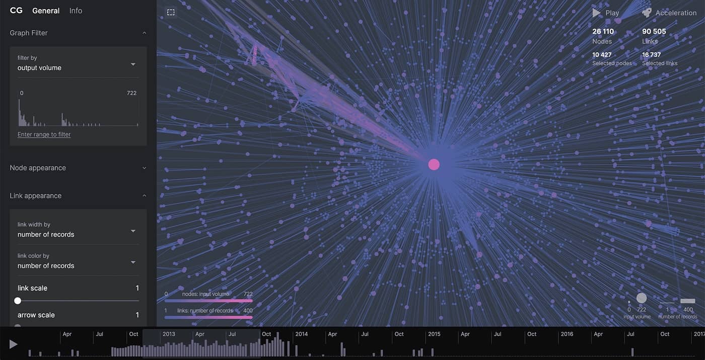
Performance with a large number of elements
Complex diagrams made up of hundreds or even thousands of nodes and connections can place a heavy load on the user interface. Performance issues don’t just slow things down – they directly affect the user experience by introducing interaction lag, longer wait times and overall frustration.
Delays as small as 100 milliseconds can be noticeable, while response times over 1 second often lead to a clear drop in user engagement.
To keep diagrams responsive and provide a smooth experience, it’s critical to apply performance optimization strategies. These help manage large datasets efficiently without overwhelming the interface.
Virtualization: renderingonly visible elements
Another challenge in working with large diagrams is keeping interactions smooth and rendering efficient – especially as the number of nodes and edges grows.
React Flow offers built-in support for virtualization, which greatly improves performance by rendering only the elements currently visible on the screen.
You can enable this with a single prop: onlyRenderVisibleElements. When active, it skips rendering nodes and edges that are outside the viewport, reducing browser load and improving interface responsiveness.
This gives React Flow an edge over other diagram libraries, many of which require non-standard virtualization solutions. It's a valuable feature in apps with dynamic or complex structures, where performance directly affects the user experience.
By rendering only what the user sees, virtualization significantly cuts down on unnecessary draw operations. It makes the diagram faster and more efficient.
Benefits:
Reduced memory usage and computing power.
Faster diagram rendering times.
Smoother interactions, such as zooming and panning.
Example use cases:
Business process diagrams (e.g., BPMN), where large datasets are split into smaller, dynamically rendered sections.
Network and IT architecture diagrams, where virtualization lets users view only the components they need at a given moment.
Minimizing unnecessary re-renders
One of the main causes of performance issues in diagram applications is excessive re-rendering of elements – even when nothing has changed. Optimizing state management to avoid unnecessary re-renders can significantly improve app speed and responsiveness.
According to the article The ultimate guide to optimize React Flow project performance, UI performance research shows that the number and complexity of rendered components directly impact on the frame rate (FPS). As the rendering load increases, responsiveness drops, and the app becomes less smooth to interact with.
Optimization strategies:
Track state changes carefully – Update only the nodes and edges that actually changed, not the entire diagram.
Batch operations – Group multiple changes into a single render cycle instead of re-rendering after each individual update.
Organizing large diagrams and managing complex structures
As diagrams grow in size, their structure becomes more complicated to manage and navigate. That’s why proper organization plays a key role – not just for performance but also for improving the overall user experience.
Splitting diagrams into flows and switching between them
One of the most effective ways to organize large diagrams is to break them into smaller, modular sections (flows) that users can switch between as needed. This approach offers several key advantages:
Improved readability – Users aren't overwhelmed by too much information at once.
Easier debugging and editing – Developers can focus on specific parts of the diagram without touching the entire structure.
Better performance – The app only renders the currently active flow, reducing load time and improving responsiveness.
Applications like Make and Zapier use this technique to manage complex data processes by dividing them into distinct, navigable segments.

Linking and organizing large diagrams: UX and clarity
In large diagrams with lots of connections between nodes, visual clarity can quickly break down. When lines are too closely packed together, the diagram becomes difficult to read and understand the overall relationships.
That’s why visual organization is critical. According to cognitive load theory, reducing the amount of information and visual complexity can lower the mental effort required from users – leading to better understanding and more effective decision-making.
Strategies for organizing large diagrams:
Hierarchical node grouping – Allow users to collapse and expand node groups so they can focus on specific parts of the diagram.
Contextual links and cross-references between sections – Instead of showing all connections at once, use smart linking to guide users between related parts of the diagram.
Interactive hints and labels – Show dynamic tooltips or labels on hover to help users quickly understand relationships without too many visual elements.
Clarity and structure of the diagram (UX) vs. the complexity of edge routing logic (technology)
The effectiveness of large, complex diagrams depends heavily on the clarity of connections between nodes. Users expect clean, intuitive layouts that help them quickly understand the structure and relationships. However, from a technical perspective, edge routing is a complex challenge – and it can seriously impact on system performance. So, how do you balance visual clarity with technical efficiency?
UX: Readability as a key factor in usability
Too many overlapping or crisscrossing connections can seriously reduce a user’s ability to interpret a diagram correctly. In business environments, like process analysis (BPMN) or IT system modeling, diagram readability directly impacts critical decision-making. Common issues reported by users include:
Overcrowded connection grids – Difficulty tracing paths and understanding relationships.
Overlapping edges – Visual clutter causing misinterpretation of connections.
Lack of logical arrangement – Confusion when trying to locate key information in the diagram.
Technical consequences: The performance cost of a readable diagram
Link routing in standard diagrams usually has minimal impact on app performance. The calculations are relatively simple and lightweight for the system. In contrast, ‘Avoids nodes’ routing – which automatically reroutes edges to avoid overlapping with nodes – is a significant performance challenge. While this feature greatly improves readability, it comes at a performance cost. This type of algorithm requires more processing power to maintain diagram clarity, especially in large structures with many connections.
In large diagrams, using an inappropriate auto-layout system or a collision-avoidance algorithm for edge routing can lead to an exponential increase in computational cost. This directly impacts performance and can reduce the responsiveness of the user interface. That’s why it’s essential to apply these mechanisms carefully and intentionally.
When a diagram contains more than 1,000 edges, rendering time can increase significantly. Statistics clearly show how important responsiveness and loading speed are to users. According to the Baymard Institute, if a page takes longer than three seconds to load, 40% of users will abandon the interaction.

Common edge routing algorithms:
Straight (simple lines) – Minimal performance impact, but in dense diagrams, it often leads to many edge crossings.
Bezier (Bézier curves) – Allows smoother connections, but calculating them requires more computing power.
Orthogonal (step-like) – Improves readability in hierarchical diagrams, though it may increase the total edge length.
Solutions:
Predefined layouts
Using structured diagram layouts can significantly improve readability. Common approaches include:
Tree view – Displays elements in a tree-like structure, making it easy to visualize hierarchical relationships and dependencies.
Hierarchical (layered) – Organizes elements into clear levels or layers, which helps users follow flows and processes step by step.
Force-directed – Automatically arranges elements by minimizing overlap and highlighting natural clusters within the network.
Manual edge routing adjustments
Instead of relying entirely on automatic routing algorithms, it’s often helpful to let users manually adjust edge paths.
Interactive edge dragging – Users can reposition edge paths to improve clarity when the default routing creates visual clutter.
Waypoints (control points) – Allow users to guide edges along more predictable paths, helping to eliminate confusing intersections.
Smart edge grouping
In diagrams with a high number of connections, edge grouping and aggregation techniques can help reduce visual clutter.
Merging parallel edges into a single shared path instead of displaying each separately.
Hidingless important connections at higher zoom levels, with the option to expandthem on demand.
Conclusion
Designing user experience (UX) for React Flow diagrams requires close alignment between visual, functional, and technical aspects. Accessibility (a11y) and full keyboard support should serve as the foundation, ensuring everyone can use the app comfortably. At the same time, drag-and-drop interactions must feel intuitive to support efficient workflows.
Styling and customization play an important role in adapting diagrams to user-specific needs, improving both usability and perception of the interface. Responsiveness and scaling are equally valid, especially when targeting different devices and screen resolutions.
Performance becomes critical when working with a large number of elements – especially in complex diagrams that require optimized edge routing algorithms.
At the same time, maintaining a balance between diagram readability and complex routing logic is essential to ensure clarity and smooth interactions.While this can be a technical challenge, it’s a key factor in delivering a satisfying user experience.
Combining all these elements leads to intuitive, efficient, and visually polished diagramming tools. All of them help users work with diagrams, without compromising interface quality or performance. And still, this is just the surface of a much broader topic – one we’ll keep exploring in future materials.