

A next-gen workflow tool delivering accessible data insights
The client was looking for a diagramming solution that didn’t just tick accessibility boxes – they needed a flexible, performance-driven tool that would deliver on inclusive design.
Their goal was to move toward a high-performance system aligned with WCAG 2.1 principles. Together, we engineered a solution that embedded accessibility into every interaction, navigation path, and visual element – not as an afterthought, but as a starting point.
Project areas:
- Full keyboard accessibility
- Real-time screen reader support
- Optimized high-contrast visuals
- Performance improvements for complex interactions
A global organization focused on inclusive digital learning.
A highly accessible workflow tool capable of supporting keyboard-first navigation, screen reader compatibility, and high-contrast visuals – while maintaining performance and flexibility for varied user roles and publishing pipelines.
End-to-end design and development of a workflow builder.
Building an accessible workflow diagramming tool from scratch

Rethinking interaction
We had to enable tab order, focus states, and screen reader logic to support keyboard users or assistive technologies – ensuring users could navigate, edit, and understand workflows without needing a mouse.

Clarifying the interface
We were tasked with introducing a clean, structured layout that reduced cognitive overload and improved overall orientation across more advanced workflows.

Maintaining responsiveness
We had to focus on rendering performance and optimized transitions to keep interactions fast and frictionless with detailed diagrams.

Enabling better navigation
To help users find their way, we had to introduce a mini-map, dynamic search, and context-aware metadata. These features had to make orientation easier and improved focus across different workflow views.

Reaching for WCAG 2.1
A tight collaboration with the client to meet accessibility goals was required. From color contrast and tab logic to screen reader compatibility, every step has to be guided by WCAG best practices.

Making actions obvious
Users have to know what actions are possible. To facilitate that, we had to introduce interaction cues, keyboard shortcuts, and real-time contextual guidance – improving clarity and reducing guesswork.
From workshops to full delivery
We uncovered technical limitations, accessibility blockers, and expectations around user experience early in the process.
We mapped flows and built wireframes with accessibility at the core – prioritizing logical paths, visible hierarchy, and compatibility with assistive tools.
We built a modular system defining visual, structural, and behavioral rules – serving as the base for implementation and testing.
Post-launch refinements were driven by usage data and real-world feedback from users relying on assistive technology.
Redesigned workflow builder with a new design system and contextual navigation features
Keyboard-first navigation for all users
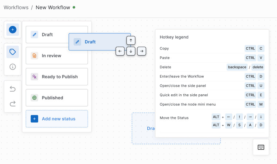
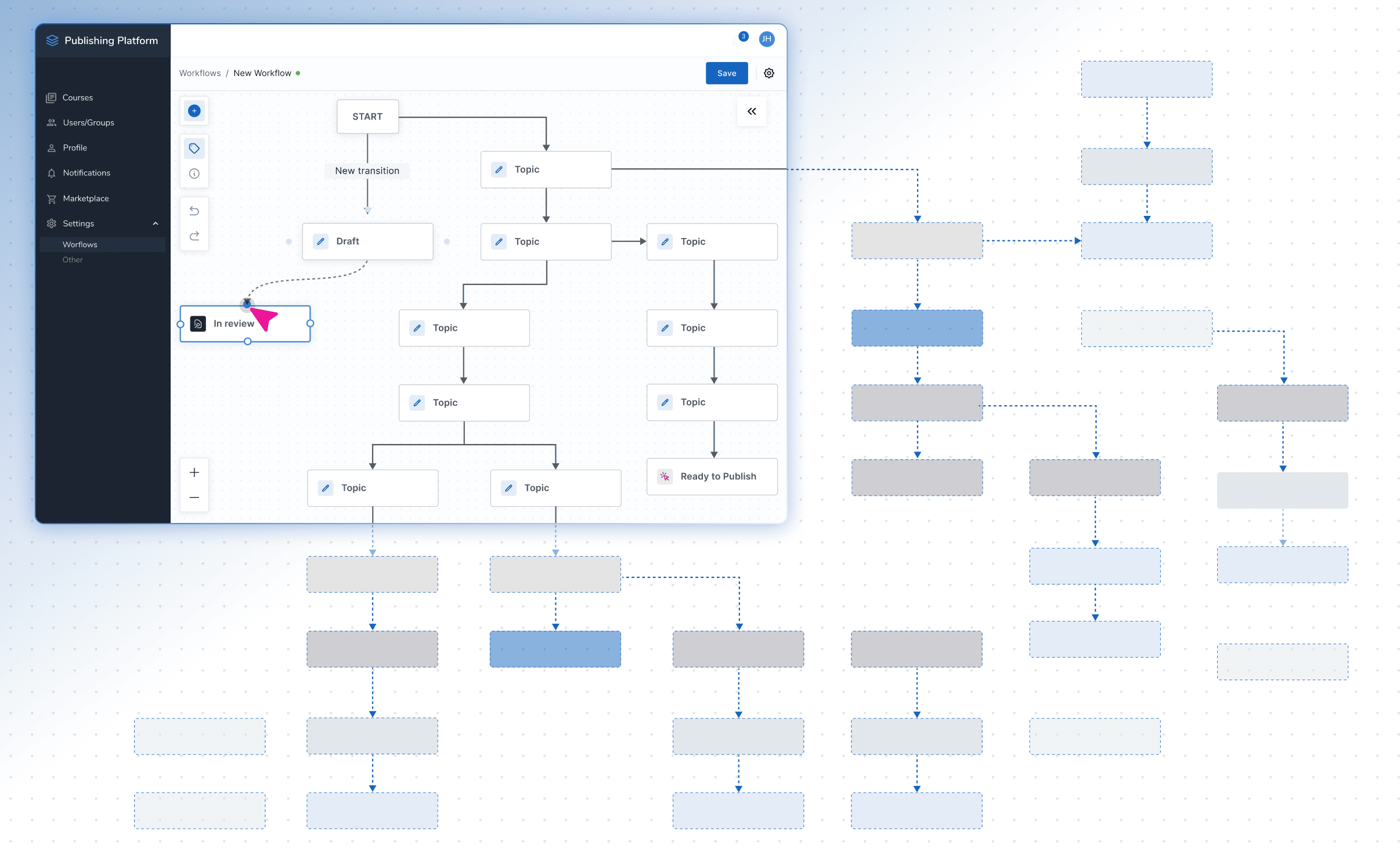
The new workflow builder supports complete keyboard navigation, including logical tab orders and hotkeys like WSAD for movement, F2 for editing, and Delete/Backspace for node removal. Focus indicators highlight the active element, giving users full control without a mouse. This structure ensures assistive technology users can follow complex workflows with clarity and precision.
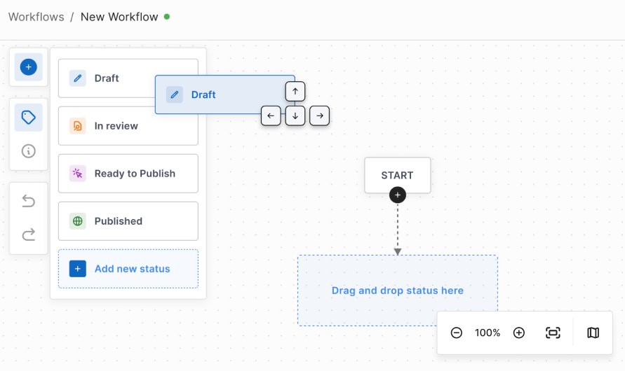
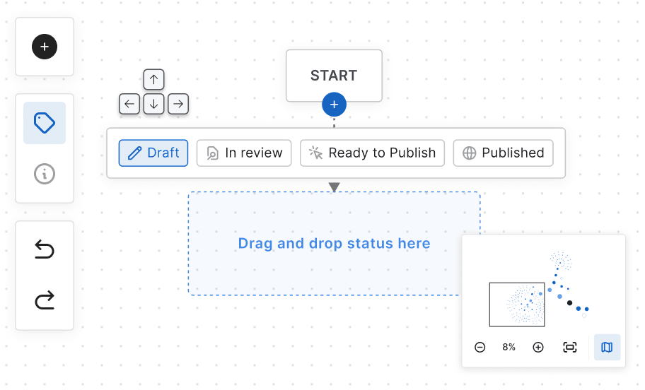
Mini-map and search for complex workflows
We added a mini-map and dynamic search box to support navigation in larger diagrams. These features help users locate specific nodes, understand workflow context, and move around the diagram efficiently. Together, they ease the navigation and make structured processes more accessible.
Structured metadata and screen reader support
We embedded detailed metadata into every link and transition, allowing screen readers to communicate workflow structure clearly. ARIA attributes were applied across the interface to describe hierarchy shifts, status changes, and transitions in real time. The system supports major screen readers like NVDA, JAWS, and VoiceOver without losing context.
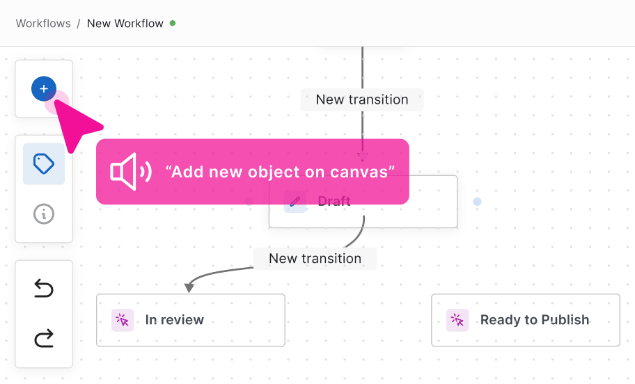
Real-time interaction list for accessible workflows
A contextual interaction list displays all available actions per view and updates dynamically based on user focus. It’s fully compatible with screen readers and provides guidance through voice output. Embedded shortcuts help streamline interactions and reduce confusion, especially for visually impaired users.

Visual accessibility with high-contrast themes
We designed the interface with high-contrast color palettes that improve readability for low-vision users. Scalable UI elements support zooming without distortion, offering better clarity across screen sizes. Users can switch between interaction methods, using keyboard controls instead of drag-and-drop if preferred.
Performance optimization for complex diagrams
To maintain speed with large workflows, we implemented lazy loading that only renders visible elements in real time. The rendering engine was fine-tuned for responsiveness to eliminate interface lag even with accessibility layers activated. This lets users navigate complex workflows without any performance bottlenecks.

Accessibility
Designed with accessibility as a guiding principle
Accessibility wasn’t an afterthought. It was a design decision from day one. Instead of retrofitting WCAG compliance, we baked it into every step: from the earliest workshops to final handoff. That meant iterative testing for screen readers, tab order, focus states, and scalable UI performance. We made deliberate choices to reduce rework later and improve experience for all users – keyboard users included.
Creating accessible diagramming tools isn’t common – because it’s hard.
Most are built for visual, mouse-based interaction. We turned that idea on its head, building for cognitive clarity, keyboard-first interaction, and assistive technology compatibility. We don’t claim to have solved everything – but this project pushed the boundaries of what accessible diagramming can look like. It’s a big leap toward what accessible workflow tools can – and should – be.
Perfect match within your digital ecosystem
We didn’t retrofit compliance. We treated accessibility as a design driver from the start. Every layout choice, every interaction, and every technical decision was made with inclusion in mind.
We built for real users – not just specs. And while there’s always more work to do, this project pushed the boundaries of what accessible diagramming can look like.
- The builder works alongside your existing tools for content creation, review, and collaboration – no need for major refactoring! No changes would be needed in your underlying data structure or back-end systems.
- All accessibility upgrades (keyboard nav, screen reader support, high contrast) apply across thousands of workflow elements without disrupting data logic.
- We use a flexible architecture that lets you update nodes and metadata dynamically through your internal system.
- The editor’s front end is decoupled and lightweight, so it can be deployed independently, minimizing risks during rollout.
How accessibility-first design improved the workflow editor

Users can interact with diagrams using only a keyboard or screen reader – broadening platform usability for people with permanent or temporary impairments.

Hotkeys, mini-map, and node search helped users move through workflows efficiently. The improved navigation logic supports structured processes without sacrificing performance.

Contextual action lists, focus states, and assistive prompts reduced user confusion – improving experience not just for screen reader users, but for everyone.
Ready to raise the bar for accessibility?
Let’s build a solution that performs at scale and reaches every user. Tell us about your project. We’ll take it from there.