Real-time data visualization: Examples and best practices

Real-time data visualization transforms raw data into actionable insights instantly – discover how it can revolutionize your operations today.

Real-time data visualization turns live data from multiple sources into instantly actionable insights. By using up-to-date information, businesses can reduce downtime, improve accuracy, and speed up decision-making. Industries from oil & gas to software development already benefit. The key? Clean, secure, and responsive real-time dashboards that prioritize the most important metrics – enabling faster reactions and stronger performance across many boards.
Real-time data visualization transforms raw data into actionable insights instantly. This article highlights best practices for building real-time dashboards that visualize time series data effectively. Discover how it can revolutionize your operations.
Modern businesses run on up-to-date data. But it's not just about collecting information – it's about seeing what matters the moment it happens. That's where real-time data visualization comes in.
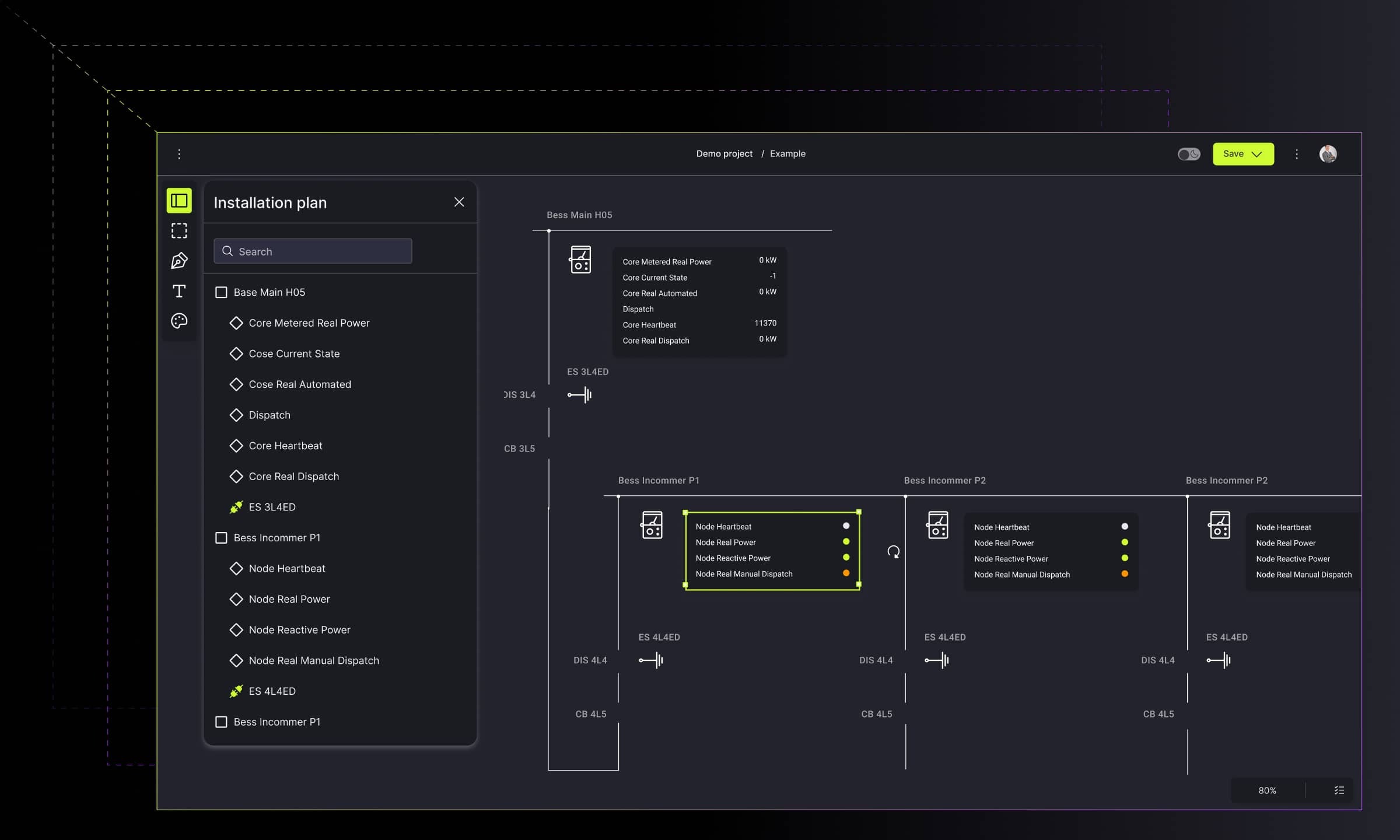
Build powerful real-time dashboards for faster decision-making
Get started.png)
Instead of waiting for reports or refreshing dashboards manually, organizations can now monitor live streams of data through intuitive visual interfaces. From monitoring factory machinery to observing customer behavior, real-time dashboards give teams the clarity to react fast, fix issues early, and spot opportunities on the fly. As organizations face more complexity, competition, and demand for instant insight, real-time analytics dashboards have become essential tools for staying ahead.
In this article, you'll learn the core concepts of real-time dashboards, see practical examples, and discover best practices for time series data visualization, whether you're a business leader or technical implementer.
What is real-time data visualization?
Real-time data visualization means transforming live data into dynamic visuals – charts, graphs, or diagrams – that update as new information arrives. These real-time dashboards enable instant insight into the current state of operations, systems, or user activity. Organizations that can access, analyze, and act on real-time data gain a significant competitive advantage.
What is a dashboard in data visualization?
A dashboard is a visual interface that organizes and displays key metrics, data streams, or KPIs in one consolidated view. It helps users monitor performance, identify trends, correlations, make informed decisions quickly, and support better management and coordination. By translating complex datasets into interactive charts, graphs, and diagrams, a dashboard turns raw information into actionable insight.
Unlike static dashboards or scheduled reports, live data dashboards are wired directly into the data sources – like IoT sensors, databases, or event streams – so decision-makers can monitor and react without delay. This makes it possible to visualize real-time IoT data, user flows, or KPIs as they evolve second by second.
The business value of data in real-time and visualization dashboards
Effective predictive dashboards drive meaningful changes in industries from finance, e-commerce, and retail to healthcare, energy, and information technology. In short, everywhere where access to current and accurate data is important.
The real power of a real-time analytics dashboard lies in its ability to shorten the distance between data and action. Real-time predictive dashboards combine live data with advanced analytics to help businesses predict trends and make smarter decisions.
Here's what you gain:
- Faster decision-making – Live metrics enable teams to act immediately.
- Improved operational efficiency – Visual alerts and filters reduce the need for manual monitoring.
- Greater accuracy – Seeing data in real-time helps catch errors early.
- Better customer experience – Real-time insights into behavior and performance let you adapt to users' needs instantly.
When used right, a dashboard for data visualization becomes more than a tool. It becomes an operational center.
Real-time data visualization examples across industries
From industrial monitoring to collaborative software tools, big data dashboards support a wide range of use cases. Below are some industry-specific examples that highlight how businesses benefit from real-time visualization.
Oil & gas – monitoring critical systems with precision
The oil and gas industry depends on continuous system awareness to prevent costly disruptions. Real-time data dashboards track pipeline pressure, valve status, and environmental metrics in one live interface. By combining real-time visualization with automated alerts, operators can immediately spot anomalies and prevent safety incidents before they escalate.
Business benefit: Reduced downtime, enhanced safety compliance, and real-time diagnostics for field engineers.
🡒See the P&ID visualization solution developed by Synergy Codes for a petroleum company
Energy – testing and simulating complex electrical systems
In the energy sector, electrical systems need constant validation and actual time tuning. With a live data dashboard, engineers can test configurations, simulate responses, and analyze results on the spot. For example, Synergy Codes helped build a schematic editor that enables fast iteration and error checking in circuit design.
Business benefit: Accelerated R&D cycles, fewer design errors, and shorter time to market.
🡒 Explore case study: Schematic Editor for intuitive electronics circuits modeling
Software development – enabling live collaboration for faster delivery
In the world of product and engineering teams, visualizing workflows and system architecture in actual time is critical. Synergy Codes developed a solution that enables real-time collaboration on codebase diagrams. The tool allows multiple users to work simultaneously on visual representations of complex systems, with immediate synchronization of changes. It ensures smooth interactions and scalability for growing development teams.
Business benefit: Higher team productivity, seamless collaboration, and fewer release delays.
🡒 Read how Synergy Codes delivered this solution
Data visualization for performance reporting and dashboards
Data visualization for performance reporting and dashboards turns complex metrics into clear real-time insights. Instead of scanning spreadsheets or raw logs, teams can track KPIs through charts, graphs, and diagrams – all in one place.
A well-designed real-time dashboard helps managers monitor targets, spot trends, and respond to issues the moment they arise. Whether you're tracking system uptime, production output, or overseeing sales management, visualizing performance in real time keeps goals visible and teams aligned.
How to collect real-time data for visualization?
Before you can build a real-time dashboard, you need a reliable method for collecting real-time data. The quality, speed, and structure of that data will directly impact how useful your real-time analytics dashboard becomes.
So, how to collect real-time data efficiently and at scale?
1. Identify your data sources
Start by mapping out where your data is coming from. Typical real-time sources include:
- IoT sensors and connected devices,
- Transactional systems (e.g., point-of-sale or e-commerce),
- Web and mobile applications,
- Internal tools or third-party APIs.
Each source must be capable of sending updates frequently, ideally as events happen.
2. Use stream-based architecture
To handle continuous data, adopt stream-first thinking. Instead of querying a database at intervals, stream using event-driven data pipelines. This ensures your real-time data dashboard reflects the latest state without delay.
3. Structure and clean your data – take care of data quality
Raw real-time inputs often come with noise, missing values, or inconsistent formats. To keep your live data dashboard accurate and readable, apply real-time validation and normalization during collection. Use pre-aggregated data or materialized views to minimize query delays in dashboards.
Key tasks include:
- Timestamping each event,
- Assigning unique IDs,
- Converting units or formats to a consistent structure.
Without this, your real-time visualization risks showing incomplete or misleading insights.
4. Store historical data selectively and smartly
Not all real-time data needs to be stored permanently. Define what should be kept for historical analysis and what can be discarded after use. Balancing real-time and historical data in dashboards provides instant insights for more informed decision making. This balances performance and cost, while keeping your data visualization dashboards responsive.
By following a structured approach to how to collect real-time data, your organization lays a strong foundation for fast, accurate, and insightful dashboards. Data that flows cleanly and reliably is what makes real-time visualization not just possible, but powerful.
Best open-source dashboard software
Open-source tools can be a strong starting point for building flexible and cost-effective dashboards. The best open-source dashboard software offers ready-made components, real-time data support, and active community input without licensing costs. These platforms often integrate with APIs, event streams, and time-series databases, making it easier to visualize data in real time.
Still, open source comes with challenges – steep learning curves, longer setup, and ongoing maintenance. That's why many companies turn to expert partners. Working with professionals speeds up delivery, reduces technical debt, and ensures your dashboards are reliable and scalable from day one.
How to implement real-time data visualization in your product or platform?
Building an effective real-time dashboard starts with more than just choosing the right tools. It's about understanding what matters most to your users, how fast they need to respond to data, and how your system can support those expectations.
To set up predictive analytics in real-time dashboards, align business goals, pick the right data, and choose suitable tools. Here's a proven path to getting there.
1. Start with the business need
Every great real-time visualization begins with a clear purpose. Ask yourself: what decisions need to be made faster? What patterns or anomalies must be visible the moment they happen?
2. Identify and ensure data accuracy streams
To make a real-time analytics dashboard truly live, you need access to continuous streams of fresh data. These can include machine sensors, user interactions, system events, or third-party integrations.
Ensure that your data is structured, accurate, and reliable. If you're dealing with high-volume or time-sensitive inputs, performance and latency become critical. So does consistency. No executive wants to make decisions based on missing or conflicting numbers. Your future big data dashboard needs to be based on perfectly aggregated information.
3. Choose dashboard design tools
Choosing the right dashboard design tools is key to building intuitive and effective interfaces showing complex data. Look for solutions that support modular components, flexible layouts, and seamless data binding. Tools should allow teams to iterate quickly, customize visual elements, and scale the dashboard as data complexity grows. Well-designed tools reduce development time and ensure your real-time data dashboard remains clear and user-friendly, even under heavy load.
4. Design for clarity and responsiveness
A live data dashboard must do more than show information. It must show the right information, at the right time, in the right way. Whether the goal is to visualize real-time IoT data from machines or monitor transactions in an app, a clean interface builds trust and enables faster decision-making. Key performance indicators (KPIs) and real-time data analytics should be central to effective dashboard design.
5. Make scalability and maintenance part of the plan
Real-time systems aren't just built once – they evolve. As your users' needs grow, so will the volume, complexity, and variety of your data. A future-proof dashboard design tool should be easy to expand, integrate with other platforms, and adjust without major rework. Consider how new data sources, metrics, or user roles can be added over time without disrupting the current setup.
6. Focus on performance, privacy, and resilience
Streaming and analyzing data in real time creates pressure on your systems and on your users. Lag, overload, or data leaks can damage trust quickly.
That's why successful dashboards for data visualization are built with clear attention to:
- Low-latency performance, even under load,
- Clear user permissions and strong data protection,
- Solid failure handling, so users always know what's going on.
Best practices for real-time dashboards with time series data
Creating a high-performing real-time dashboard isn't just a tech task. It's also about thoughtful design, clear communication, and continuous improvement. These best practices will help ensure your real-time analytics dashboard delivers great value.
Prioritize what matters most
A good interactive dashboard answers one question: What needs my attention right now? Whether you visualize real-time IoT data or monitor live user behavior, relevance drives better decisions. The dashboard layout should prioritize key information by placing the most critical metrics at the top. That's why you should:
- Avoid overloading users – dashboards should display about 5-7 core KPIs to avoid overwhelming,
- Focus on metrics that indicate risk or opportunity,
- Use layout hierarchy and white space to highlight key insights.
Design for clarity and speed
Live data dashboards must be quick to scan. Users often rely on them in high-pressure moments. Follow these principles:
- Stick to simple, readable chart types,
- Use color carefully and consistently,
- Highlight current status and spot trends,
- Show timestamps to confirm freshness.
In addition, do not forget about responsive versions of your platform. Many access real-time dashboards on smartphones and tablets. To all of these, use ample white space effectively to separate elements and ensure a clean, professional look.
Remember about accessibility and WCAG compliance
When designing real-time dashboards, accessibility should never be an afterthought. Ensuring your dashboard is usable for everyone – including people with disabilities.
Follow the WCAG (Web Content Accessibility Guidelines) to integrate the dashboard with accessibility standards. This includes using readable fonts, clear contrast ratios, and keyboard navigation support.
Use a consistent, colorblind-friendly palette. Many users cannot rely on color alone to interpret data. To avoid confusion, always combine color with shapes, labels, or patterns. For example, don’t just highlight alerts in red. Use icons or text to reinforce meaning.
Download the Accessibility Checklist for diagramming solutions
Get it Enable interaction
Great real-time visualization lets users do more than observe. Add features like:
- Filters and time range controls,
- Drill-down options,
- Alerts or notes that explain changes.
In fast-paced industries, this interactivity supports faster, smarter reactions.
Build for trust
Trust is key. If your real-time data dashboard lags or shows inaccurate data, users will disengage. Build reliability with:
- Indicators for delayed data,
- Logged updates behind the scenes,
- Manual refresh options.
Keep improving with feedback
Treat dashboards for data visualization as living tools. Watch how users engage, gather feedback, and regularly review and refine dashboards based on user feedback and evolving business needs. Iterating based on real behavior boosts adoption and long-term success.
Best practices for real-time dashboards – do’s and don’ts
Ensure data security
When building dashboards, protecting sensitive data is just as critical as visualizing it. Real-time access to key metrics from multiple sources introduces potential risks if data security isn’t prioritized from the start.
Secure your data sources using strong authentication and encrypted connections to prevent unauthorized access. To protect sensitive data, it’s essential to implement proper access controls –ensuring that only authorized users can view or interact with specific data.
To ensure full transparency and compliance, enable access logs and audit trails. These show who viewed what data, from which device, and whether any attempt was made to modify views or data sources. This supports internal accountability and helps meet regulatory standards like GDPR or HIPAA.
The key benefit of secure, real-time visualization? Confidence. When your team knows the data is clean, current, and protected, they can act faster – with full trust in what they see.
From insight to action – what's next?
Real-time data visualization has become a foundational capability for modern organizations. It powers agility, improves customer experiences, and turns scattered metrics into a live view of your business.
At Synergy Codes, we help companies bring real-time monitoring to life – from initial concept to fully functional real-time dashboards that scale with your growth. Whether you're building from scratch or modernizing an existing solution, our full-stack team combines frontend craftsmanship with deep data understanding.
🡒 Explore our real-time diagram services and get started today
- How does real-time data visualization differ from traditional reporting?
Traditional reporting relies on static reports that summarize past events, while real-time data visualization shows what’s happening the moment it occurs. Instead of waiting for daily or weekly updates, teams can monitor performance metrics as streaming data flows in, detect issues instantly, and respond before they escalate.
- What is real-time data visualization, and why does it matter?
Real-time data visualization converts live data streams into visual formats – such as charts, graphs, or diagrams – that update instantly as new information appears. It helps teams spot issues early, make faster decisions, and respond immediately to changing conditions.
- Is it possible to combine real-time and historical data in one dashboard?
Absolutely. The most effective dashboards blend live insights with past trends through real-time data integration. This approach replaces static reports and manual data compilation with continuous, automated updates. Such dashboards let teams compare what’s happening now with historical performance – gaining both immediate awareness and long-term context in one unified view.
- What are the main steps to implement real-time visualization?
To build an effective real-time visualization, follow these key steps:
- Define business goals – identify what decisions need faster insights and what metrics matter most;
- Map data sources – list your live data sources, such as IoT sensors, web apps, or internal systems;
- Validate and clean data – ensure accuracy, remove inconsistencies, and standardize formats;
- Select the right tools – pick platforms that support real-time updates, scalability, and customization or use help of an experienced technology partner like Synergy Codes;
- Design for clarity – focus on clean layouts and intuitive visuals that highlight key metrics instantly.
Done right, these steps turn your dashboard into a real-time decision engine, not just a display.
- How can design improve real-time dashboard usability?
Good design makes live data easy to read and interpret. Use simple chart types, consistent colors, and clear hierarchy. Keep the interface uncluttered so users can focus on what matters most – understanding the current state and acting fast.
- Which industries benefit most from real-time visualization?
Real-time data visualization adds value across nearly every industry – wherever up-to-date information supports faster and smarter decisions. Moreover, sectors like oil and gas, energy, manufacturing, logistics, healthcare, finance, e-commerce, retail, and software development use live dashboards to stay ahead. For example, energy companies track circuit performance in real time and retailers observe customer behavior to adapt offers instantly. In short, any business that relies on timely insights can benefit from real-time visualization.
Content Marketing Specialist who's spent the last decade making tech topics actually readable. With an MA in Brand Communication, Ida has crafted content strategies for several IT companies. Her portfolio spans from Kubernetes tutorials to enterprise software guides, now focusing on data visualization and diagramming solutions.

Find how we can help you enhance your software and win more deals
Contact us to discuss your project. After you submit the form, we’ll get in touch with you within 48 hours to arrange a call.


.png)