


Build dynamic interfaces for mapping and monitoring infrastructure
Real-time data visualization development is our service for building diagramming interfaces where users can depict machines, installations, and other heavy industry facilities. In other words, they can create digital twins of these objects.


Next, we connect it to your data tracking devices to set up real-time data transfer and visualize it on diagrams.
You get an instant view of your entire machine system with live status, whether for process monitoring in power plants, refineries, or factory floors.

Custom IoT monitoring dashboard vs SCADA
Explore the SCADA alternative. Uncover how custom IoT monitoring dashboards offer scalable and interoperable solutions compared to traditional SCADA systems.
Work with experts in building real-time data visualization
Use our yearslong expertise in delivering real-time data visualization solutions for heavy industries
We apply our experience with clients of various shapes, sizes, and profiles from such sectors as Oil & Gas, Energy, and Manufacturing
With dozens of heavy industry-specific projects delivered, we help you depict your systems and visualize your data with clarity
All major industries use our industrial interfaces
Get help with building digital twins and monitoring data in real time. Leverage our expertise in interactive network technologies for heavy industries.
Client:
A global integrated energy company that produces and markets energy: oil and biofuels, natural and green gases, and renewable energy.
Deliverables:
- Digital twin’s builder of a refinery with drag & drop interface. Users can reflect a refinery using pre-made objects from a palette.
- Real-time data transfer from API to a refinery diagram. Depicting API data on various visualizations directly on a refinery diagram and a dashboard.
- A system of alerting diodes displayed on a diagram that informs about issues occurring in a refinery.
Client:
Leader in fluid management solutions offering compressed air, filtration, measurement and control, and process equipment products and services.
Deliverables:
- An application for diagramming pipe installations that present and simulate how fluid flows through pipes under different pressures on signal flow diagrams.
- A drag-and-drop user interface for diagramming installations. Users can drag the installation’s objects from a palette and drop them on the canvas.
- Real-time data transfer from installation to its diagram. Data on a diagram is shown on tables and charts inside the diagram’s objects.


Client:
A provider of satellite and wireless communication solutions, specializing in hardware and software for military, government, and commercial sectors.
Deliverables:
- An application for visualizing, monitoring, analyzing, controlling, configuring, and automating device chains connected to satellites.
- Real-time data transfer from satellites and devices to the application.
- Easy-to-navigate, drag & drop UI that simplifies diagramming devices and monitoring data.
Client:
A multinational corporation that manufactures luxury vehicles and motorcycles.
Deliverables:
- A drag & drop interface where users can diagram factory machines and devices.
- Data transfer from devices sensors to their diagrams in real time.
- Displaying sensor data on diagrams on various visualization types, such as signal flow diagrams.


Client:
A global market leader in energy storage products and services, and cloud-based software for renewables and storage assets.
Deliverables:
- Drag-and-drop interface for creating renewable energy plant diagrams and single line diagrams for electric circuits with industry-specific objects and symbols.
- Connects objects with data points, allowing users to define connections.
- Real-time alerts that enabling tracking sensor data and notify users of system status, with customizable alert rules.
- Control panel for adjusting machine properties directly on diagrams.
- Data points table view with three options:
– Grouped by facilities.
– All data points together.
– Custom list chosen by the user.
Client:
A supplier of environmentally friendly heating equipment specializing in producing geothermal heating systems and district heating solutions.
Deliverables:
- Drag & drop interface where users create single line diagrams for electric systems from pre-designed industry-specific objects and symbols.
- Connecting a diagram's objects to data points. Each object can represent data from an individual device.
- Objects showing real-time data from sensors in a table view.


Diagrams interfaces are not just technical tools. They are intuitive communicators between people, and a way to present complex industrial processes simply.
Pre-built components for real-time data monitoring on digital twins

Transfer sensor data to infrastructure’s diagrams in milliseconds to monitor and analyze critical information

Visualize sensor data on a customized dashboard to enhance your infrastructure’s state monitoring and analyze its effectiveness

Be notified about potential issues when sensors act incorrectly and address possible malfunctions or critical installation conditions

Visualize and predict operational outcomes to understand errors before they occur and ensure continuous operations without disruptions

Build a digital twin of your infrastructure on a drag & drop interface with pre-designed objects and symbols

Adjust machines and installations properties such as temperature or power output directly on their diagrams through a control panel

Build your custom table with the most used data points to focus on analyzing the most vital data

Visualize gathered data on charts and tables directly on an infrastructure’s diagram to speed up drawing conclusions

Leverage diagram interface to illustrate the components, interactions, and structure of a network, and provide an overview of how it is designed and organized

Set custom rules for alerting diodes’ look and behavior and observe them on an infrastructure’s diagram to know which metrics show anomalous data
Real-time data visualization ensured by fast data transfer to diagrams
To maximize data rendering speed, we use GraphQL and its WebSocket to send sensor data from a device to diagrams built on HTML5 Canvas.


Benefits of working with experts in industrial and engineering infrastructure diagrams
UX/UI expertise
Develop sleek and intuitive interfaces, single line diagrams and singnal flow diagrams that make navigation effortless. Simplify the user journey across your diagramming interfaces and dashboards to transform users into power users.
Optimized performance
Get your code reviewed to spot, fix and prevent performance issues. Switch to canvas-based visualizations for better efficiency in rendering complex diagrams.
Ensured responsiveness
Make your app work without a hitch on different devices and screens with variable breakpoints.
Design that delights
Make your product enjoyable to use with intuitive designs and compelling features. Enrich your product with captivating visuals, subtle micro interactions and powerful data presentation techniques.
What our customers say
While looking for a proficient service in creating graphical components, we wanted to work with experts that would advance our tool with exceptional UX and UI, which enabled us to win new deals with significant clients.

It’s been a pleasure for us to deal with Synergy Codes. They’re very good at capturing our needs. Their analysts have added value to our project through not only understanding our needs, but by proposing better ideas where they’re able to.

Our cooperation with the Synergy Codes team proved they are a professional data visualization engineering company. They demonstrated exceptional technical skills, attention to detail, and a deep understanding of user experience.

FAQ
- What makes your service a viable alternative for SCADA systems?
Our service offers more user-friendly and dynamic user interfaces for digital twins' solutions than SCADA systems. Users can tailor the interface and functionality to their specific requirements. Our interfaces are also easier to scale and integrate with modern technologies.
- How does your platform enhance traditional HMI/SCADA systems?
Our service focus on developing advanced diagramming interfaces where users can depict devices’ networks, processes, and structures. These interfaces are created by seasoned UX and UI designers who take care of their appearance, usability and consistency. As a result, you can get unparalleled interface for your digital twin’s solution.
- Is your service like developing HMI software?
Yes, our service aligns with the core functions of HMI software, which typically include real-time data visualization (displaying live data from machines and systems) and diagramming interfaces (creating graphical representations of machines, installations and facilities), such as single line diagrams or signal flow diagrams.
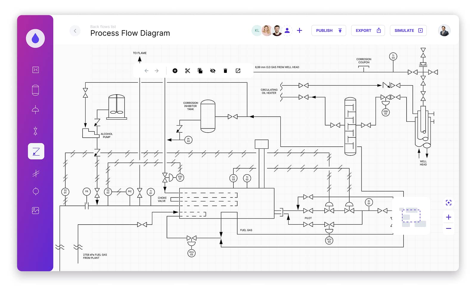
- Can I create process flow diagrams in your diagramming interface?
Absolutely. Process flow diagrams are perfect for depicting complex processes in various facilities, such as refinery objects. Other common forms that you can create are single line diagrams and signal flow diagrams.
- Who can benefit from your custom diagramming software development for IoT?
A wide range of individuals and organizations across various industries can leverage our service. Among them are manufacturing companies, energy and utilities organizations, and logistic and supply chain firms.
Map industrial infrastructure and monitor its data in real time on diagramming interfaces
Interested? Reach out to discuss your needs with an expert. You might also benefit from the product discovery phase, that helps customers like you to define requirements and possible scope.