The best AI tools for data visualization to consider in 2026

This guide explores the best AI data visualization tools in 2026, breaking down their benefits, features, and ideal use cases. Find the right fit!
AI data visualization tools empower users to turn raw data into clear, engaging visuals using automation, natural language processing, and user-friendly design. This article compares 17 top tools in 2026 – from simple text-to-diagram generators to advanced BI platforms – highlighting how they simplify data analysis, enhance decision-making, and make complex insights accessible to all.
This guide explores the best AI data visualization tools in 2026 – including Whimsical, Lucidchart, dAIgram, Deckpilot AI, and many more – breaking down their benefits, features, and ideal use cases. The article is for developers, graphic and UX designers, and every team seeking AI-powered solutions for visualization.
2026 will be a year in which AI-driven automation, multimodal analysis, and natural language interfaces become standard across the industry. Over the last year, data visualization tools have evolved from simple chart creators into advanced assistants capable of analyzing, structuring, and transforming data into interactive visual content with minimal human input.
Build smarter apps with LLM-powered knowledge graphs
Learn more.png)
Data has become the backbone of decision-making across industries, and the demand for clear, insightful, and automated data visualization has never been higher. AI-powered tools are revolutionizing the way businesses, analysts, and designers interact with data, enabling them to generate compelling visuals with minimal manual effort. This guide explores the best AI data visualization tools in 2026, breaking down their benefits, features, and ideal use cases. Whether you're looking for a voice-to-diagram tool, an AI diagram generator from text, or a self-service BI tool, this article will help you find the right fit.
What are AI data visualization tools?
Before diving into the tools themselves, it’s important to define what we mean by AI data visualization.
It is software that uses artificial intelligence to help users turn data into visual content – like charts, dashboards, or diagrams – automatically and intuitively. This category includes:
- AI chart creators, which generate visual charts or graphs from datasets;
- Text-to-diagram generators, which turn written descriptions into structured visual diagrams;
- Presentation generators, which transform data into slide-ready visuals;
- Mind-mapping and brainstorming tools, which help teams visually organize ideas with the support of AI structuring and suggestions;
- AI-enhanced BI platforms, which offer advanced analytics, predictive modeling, and real-time dashboards for business use.
These tools vary in complexity – from quick, intuitive platforms for everyday tasks to enterprise-grade solutions for deep data analysis and reporting.
These tools typically combine:
- Natural language processing (NLP) – so users can ask data questions in plain language,
- Automation – to speed up the process and reduce manual effort,
- User-friendly interfaces – making them accessible to people without great technical or design skills.
Key features to look for in AI data visualization tools
Before diving into the top AI tools for data visualization, it's essential to understand the features that define a powerful tool in 2026. Here are some must-have capabilities:
1. Automated chart and graph generation
AI-powered tools can generate charts, graphs, and infographics automatically based on raw data, eliminating manual work and speeding up decision-making.
2. Text-to-diagram AI free options
For teams working with flowcharts and process maps, AI diagram generators from text are invaluable. These tools convert text descriptions into structured diagrams, making them useful for brainstorming, project management, and technical documentation.
3. Voice-to-diagram functionalities
Allows converting spoken instructions into diagrams on the fly – not yet widespread, but growing in importance thanks to fast diagram creation and improved accessibility.
4. Data-driven insights with AI assistance
Many AI data visualization tools provide predictive analytics and trend spotting. They offer insights that go beyond regular reports.
5. Integration with business intelligence platforms
Top tools connect with other business intelligence programs. This lets users create data dashboards without much coding.
6. Customizability and design collaboration tools
For those seeking flexibility, AI-driven mind mapping software, flowchart makers online, and graph creators – AI tools have to provide extensive collaboration and customization options. Users can save customization templates for recurring report generation, streamlining future documentation needs.
7. Interactive dashboards
Most developed AI data visualization tools include interactive dashboards that allow users to customize views.
8. Multimodal AI capabilities
AI tools now combine text, images, diagrams, and datasets into unified visual outputs. Users can upload mixed data formats, and AI automatically selects the best visualizations.
9. AI agents that work with your data
Many 2026 tools introduce autonomous or semi-autonomous AI agents that can monitor dashboards, detect anomalies, update reports, or notify users about pattern changes.
10. Automatic UI component generation
Modern visualization systems can generate not only charts but ready-to-use interactive UI components, such as filters, drill-down panels, or dashboard layouts.
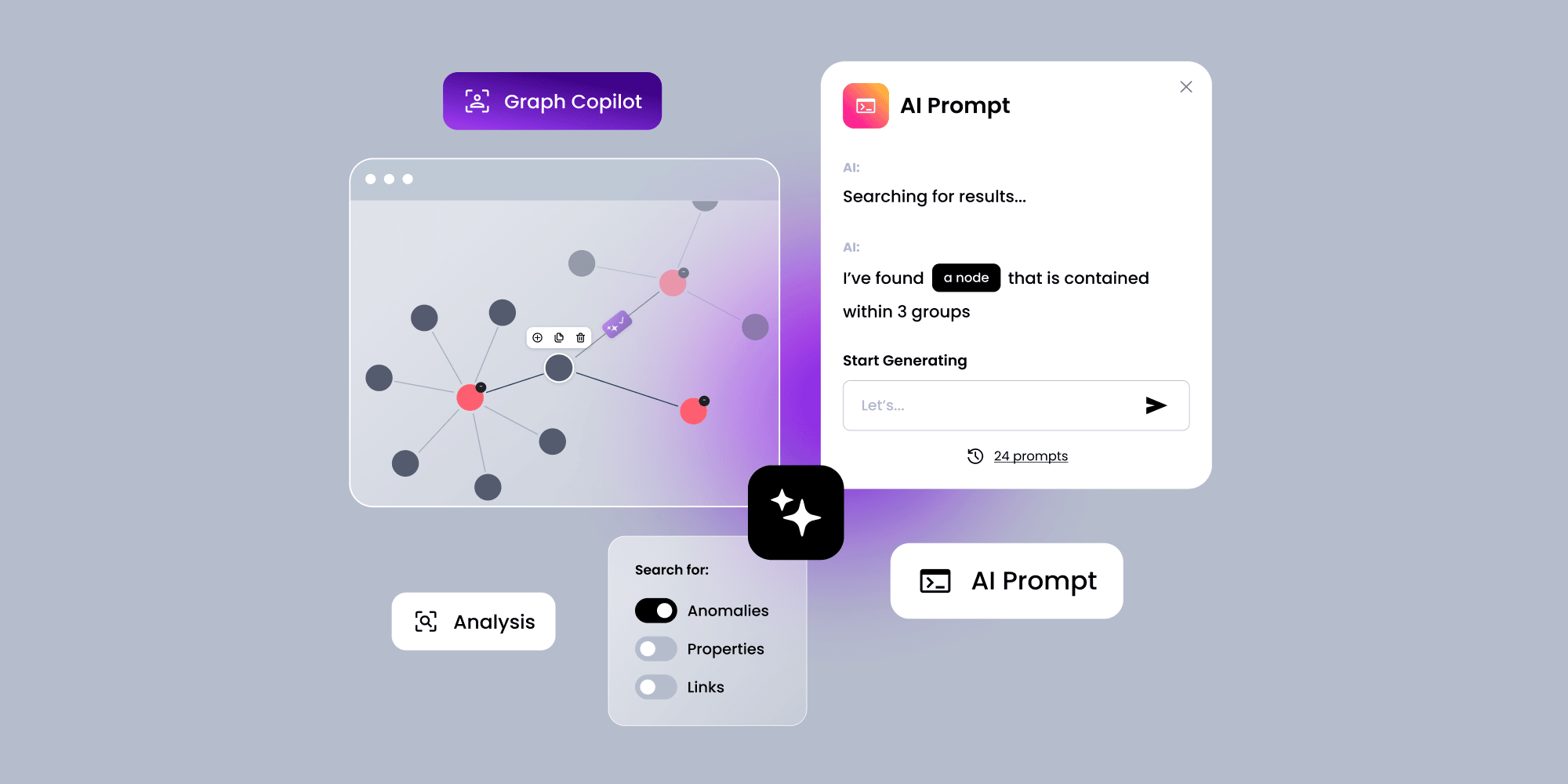
Turn spoken instructions into diagrams instantly with AI
Learn more
Top AI data visualization tools in 2026
Now, let's explore the best AI-powered tools for visualizing data to consider this year. These platforms offer a mix of free AI data visualization tools, business intelligence features, and user-friendly interfaces.
With those tools visualization process can become less time-consuming, allowing teams to focus more on strategic actions.
1. Whimsical
Whimsical is a lightweight, AI-powered flowchart generator online that helps teams create mind maps, wireframes, and diagrams with ease. It is especially useful for UX/UI designers and project teams that need to visualize workflows efficiently. The AI features allow users to generate quick layouts from text inputs, streamlining the brainstorming process.
2. Lucidchart AI
Lucidchart AI is one of the most advanced AI diagram tools, allowing users to create complex flowcharts, and data-driven diagrams. Its AI-driven automation helps map out business processes efficiently, making it an excellent tool for professionals working with structured data and workflow visualization.
3. dAIgram app
A rising star among free AI diagram generators from text, dAIgram is designed for rapid text-to-diagram conversion, making it perfect for quick visualizations. It is particularly helpful for software developers, engineers, and educators who need to create structured diagrams without manually designing each element. DeckPilot AI allows customization of reports with branding elements such as logos and colors.
4. Visme AI
Visme AI merges visualization with AI. It is a strong alternative to business intelligence tools for creative pros. It helps users make presentations, infographics, and reports. Its AI design tips create engaging content. It's perfect for marketing teams and corporate professionals.
5. Deckpilot AI
Deckpilot AI helps teams with data-driven decision making by providing quick access to visualized data. It simplifies report creation by automatically generating visuals, saving time, and transforms spreadsheet data into presentation-ready charts.
The tool supports interactive editing with natural language comments and allows users to integrate via REST API. Moreover, DeckPilot AI processes uploaded data in spreadsheet formats like XLSX or CSV to generate PDF reports with charts such as column, pie, and line graphs.
Automate workflows with powerful AI agents and diagrams
Learn more
More top AI data visualization tools in 2026
Let's continue exploring additional AI data visualization generators that can transform raw data into compelling insights. Whether you need an AI diagram generator from text, a free AI data visualization tool, or a flowchart maker online, these platforms offer innovative solutions to meet various visualization needs.
6. Canva Magic Design
Canva's Magic Design is an AI-powered feature that automates the creation of visually appealing graphics, including AI chart creators, infographics, and reports. Its intuitive interface allows users to input data, and the AI suggests polished layouts, making it ideal for marketers, educators, and business professionals looking for quick yet high-quality visuals.
7. Boardmix
Boardmix is an AI-driven collaboration tool that enables teams to create flowcharts, mind maps, and strategic diagrams. Its AI functionalities assist users in structuring ideas and automating diagram creation, making it next excellent option for brainstorming and project planning.
8. Figma Design AI
Figma's AI-powered design tools suggest smart ideas and automate layouts. They help teams streamline UI/UX design. It's not a traditional data visualization tool. However, its AI enhancements make it great for teams that need structured visuals and interactive prototypes.
9. Miro AI
Miro AI boosts digital whiteboarding. It suggests ways to structure ideas, generates diagrams, and automates connections between elements. It is particularly useful for teams that engage in strategic planning, wireframing, and knowledge mapping.
Quick comparison of AI data visualization tools
Before moving on to more advanced tools, here is a comparison of the data visualization AI tools we have already covered. This section provides an overview of their key features, strengths, and limitations to help you better understand how they compare and which might best suit your needs.
Final data visualization AI tools to explore
In the previous sections, we covered a variety of AI-powered data visualization tools, each offering unique features to help businesses and individuals create compelling visuals. Now, we'll conclude our list with some of the most advanced and widely used AI data visualization generators designed for in-depth analytics, business intelligence, and interactive dashboards.
10. Synergy Codes – AI-Powered Features
Synergy Codes offers AI-powered data visualization capabilities tailored for business intelligence, process mapping, and advanced analytics. With a strong focus on usability, its AI-driven approach helps users quickly structure complex datasets into readable and insightful visuals.
11. Tableau AI
Tableau AI is one of the most powerful business intelligence tools available, designed for companies that need deep insights and predictive analytics. Its AI-driven engine automatically detects patterns in large datasets and provides smart recommendations for visualization. Tableau's interactive dashboards allow users to explore complex data relationships dynamically, making it a go-to solution for enterprises looking to refine their decision-making processes. Additionally, Tableau's premium products integrate AI functionalities for data visualization and automated analysis.
12. Power BI Copilot
Copilot is a general-use AI model created by Microsoft that aids in various coding languages, whereas Power BI Copilot allows users to generate automated reports, detect trends, and create data visualizations effortlessly. One of its standout features is the natural language query function, which enables users to ask questions about their data and receive instant AI-generated responses in the form of visuals or summaries. This makes it a preferred choice for businesses that rely heavily on structured financial and operational data.
13. Qlik Sense
Qlik Sense enables users to perform complex data analysis without requiring advanced coding skills. The AI-powered features allow for smart data discovery, automatically identifying key relationships and trends within datasets. With intuitive drag-and-drop capabilities and natural language processing, users can create rich, interactive dashboards tailored to their specific needs. The tool is particularly valuable for enterprises that need robust analytics with real-time updates.
14. Zoho Analytics
Zoho Analytics is a user-friendly AI-powered business intelligence tool designed for small and mid-sized businesses. It simplifies the process of generating insights by providing automated reports and AI-driven suggestions. Its straightforward interface allows users to create customized visual reports from multiple data sources. Additionally, Zoho's AI assistant helps users analyze their data through conversational queries.
15. Domo
Domo's AI-driven data visualization platform provides real-time business intelligence, making it ideal for organizations that require up-to-the-minute insights. Its AI capabilities help process large volumes of data efficiently, allowing businesses to monitor performance, detect trends, and visualize key metrics in an interactive format. Domo's cloud-based nature ensures accessibility across teams, making it an excellent choice for dynamic business environments that require fast decision-making.
16. ThoughtSpot
ThoughtSpot is an AI-powered analytics platform that focuses on natural language processing and search-based analytics. Unlike traditional BI tools, ThoughtSpot allows users to type queries in plain language and receive instant data-driven insights. This makes it an excellent choice for non-technical users who need quick and reliable access to business information. It is widely used in industries where instant data exploration and quick decision-making are essential.
17. Sisense
Sisense uses AI for predictive and embedded analytics. It lets companies embed real-time, AI-driven insights into their workflows. Sisense's AI engine can detect patterns and anomalies. It provides insights for businesses that want to improve performance and predict trends. It is best for companies that need deep analytics in their processes.
Quick comparison of data visualization AI tools
The AI-powered data visualization tools in this category do more than create AI charts and help with design. They offer advanced analytics, predictive modeling, and business intelligence. These solutions are ideal for enterprises and data analysts. They offer deep insights, automation, and AI-driven decision support.
Look for Natural Language Processing (NPL)
Natural language processing simplifies data exploration by allowing users to create visualizations through text prompts. NLP capabilities in data tools enable users to generate visualizations and insights without needing to know programming languages like SQL or any other. Tools that allow users to create visualizations through text prompts can democratize data access, making data available to everyone in an organization.
An emerging extension of NLP is voice-to-diagram technology, which converts spoken instructions into structured diagrams. Although not yet widely adopted, its importance is growing as it enables on-the-fly diagram creation, improves workflow speed, and supports accessibility for users who prefer or rely on voice interaction.
Final thoughts on the best data visualization software & tools in 2026
AI-powered data visualization tools have changed how we analyze and present data. They make complex insights more accessible and actionable. These tools boost efficiency and automate tasks. They also provide insights with AI-driven recommendations. They are useful for business, analytics, and creative work.
This guide explored many solutions. They ranged from simple diagram generators to advanced business intelligence platforms. Some tools help make visual content easier to create. Others focus on deep data analysis and predicting trends. Some tools are for quick, easy visualization. Others are for large-scale enterprise analytics. Want to know how to incorporate AI visualization solutions into your company? Leave a message in the contact form below.
- What is an AI‑powered data visualization tool?
An AI‑powered data visualization tool uses artificial intelligence to automate the creation of charts, dashboards, or diagrams. It often includes features like NLP (natural language processing), auto‑formatting, smart design suggestions, and real‑time analysis to speed up and simplify data exploration.
- What is the best AI tool for creating charts and graphs?
The best tool depends on your needs. For quick, intuitive visuals, try tools with prebuilt templates and drag‑and‑drop features. For more advanced users, platforms with predictive analytics and real‑time dashboards offer deeper insights and automation.
- Is AI data visualization useful for non‑technical users?
Absolutely – most of the AI data visualization tools are built with user‑friendly interfaces and natural language processing, so anyone can ask questions, explore data, and create visuals without great coding or design skills.
- Can I use AI to make data dashboards automatically?
Yes! Many AI data visualization tools include automation features that turn raw data into interactive dashboards. These dashboards update in real time and help teams monitor performance, spot trends, and make decisions faster. You don’t need to start coding from scratch – you can use one of the ready‑to‑use tools described in this article to build dashboards quickly and efficiently.
- How does an AI text-to-diagram tool work?
Text‑to‑diagram AI tools – like dAIgram – turn plain language descriptions into structured diagrams. You simply type out a process or idea, and the tool generates a visual flowchart or mind map, helping you visualize concepts without manual design.
- What is voice to diagram, and how does it work?
Voice-to-diagram is a feature that converts spoken instructions into structured diagrams in real time. It captures your speech, interprets intent with AI, and automatically generates layout and node-link structure – enabling quick, hands-free diagram creation and improved accessibility.
Content Marketing Specialist who's spent the last decade making tech topics actually readable. With an MA in Brand Communication, Ida has crafted content strategies for several IT companies. Her portfolio spans from Kubernetes tutorials to enterprise software guides, now focusing on data visualization and diagramming solutions.

Find how we can help you enhance your software and win more deals
Contact us to discuss your project. After you submit the form, we’ll get in touch with you within 48 hours to arrange a call.