Interactive diagrams – how dynamic visualizations simplify complex processes

Discover how interactive diagrams simplify complex data, enhance decision-making, and are built using JavaScript, GoJS, React, and Angular for dynamic visuals.
.jpg)
Interactive diagrams turn complex data into clear, actionable visuals that help users explore processes, run simulations, and spot bottlenecks across industries like manufacturing, gas and oil, cybersecurity, aviation, retail, and data analytics. By combining structure, interactivity, and technologies such as JavaScript, GoJS, React, and Angular, they enable faster decisions, stronger collaboration, and better system understanding.
Interactive diagrams are dynamic visuals that make complex information easier to understand, which is why they’re becoming essential in data visualizations and data analysis. That's why there are many types and two main modeling languages. Let's take a closer look at what diagrams are, why they are so crucial for modern industries, where they find their usage, and what good practices are in diagram creation.
Discover how interactive diagrams simplify complex data, enhance decision-making, and are built using JavaScript, GoJS, React Flow, and Angular ngDiagram for dynamic visuals.
This article provides a clear overview of interactive diagrams – what they are, where they’re used, and how to create them effectively. You’ll learn about their main types, benefits, and practical examples across industries. If you are a product or process manager, developer, UX/UI designer, or just a professional looking for clear information about designing interactive elements within diagrams, you are at the right place.
Build powerful and fully interactive diagram solutions
Check the offer.png)
Difference between diagrams, charts, and graphs
Let's start with a few definitions. Diagrams are often used as a synonym for charts and graphs. However, it's misleading because, despite similarities, there are also significant differences between these three terms.
As for diagrams and graphs, one should remember that all graphs are diagrams. However, not every diagram is a graph. Diagrams show hierarchical dependencies between data or how systems work. They indicate, for example, the task sequence within a project. Diagrams are also there when you need a tool to present some notions.
On the other hand, graphs are the best for presenting or comparing some variables in a set of information. They are useful in depicting, e.g., the population within a specific period or any other depictions of variables on axes. Whereas charts are useful when you need to present a categorized large set of data. However, charts are the widest group and can depict data in the form of charts and graphs as well.
What are interactive diagrams?
Diagrams have been assisting people since prehistoric times because they are irreplaceable and the most effective way of presenting information. Consequently, they find wide applications not only in everyday life but also in business.
But what are diagrams? In data visualization, they are a specific visual display that presents information or data depicted symbolically in the form of different shapes, arrows, lines, or other optical links. They are used to simplify dealing with big datasets and explain complex processes and structures as easily as possible. Interactive diagrams allow users to explore information in a meaningful way, unlike static images. They let you manipulate data and reveal patterns or trends that would stay hidden in a static view. Interactivity also improves communication by simplifying complex information – even within teams. Interactive elements support group work and shared problem-solving, strengthening teamwork, communication, and critical thinking.
Diagrams and interactive diagrams – what's the difference?
Since diagrams can turn complex processes and structures into easy-to-read visualizations, they make data mining and project management much more straightforward and effortless, allowing data analysts and managers to draw conclusions and offer data-driven solutions.
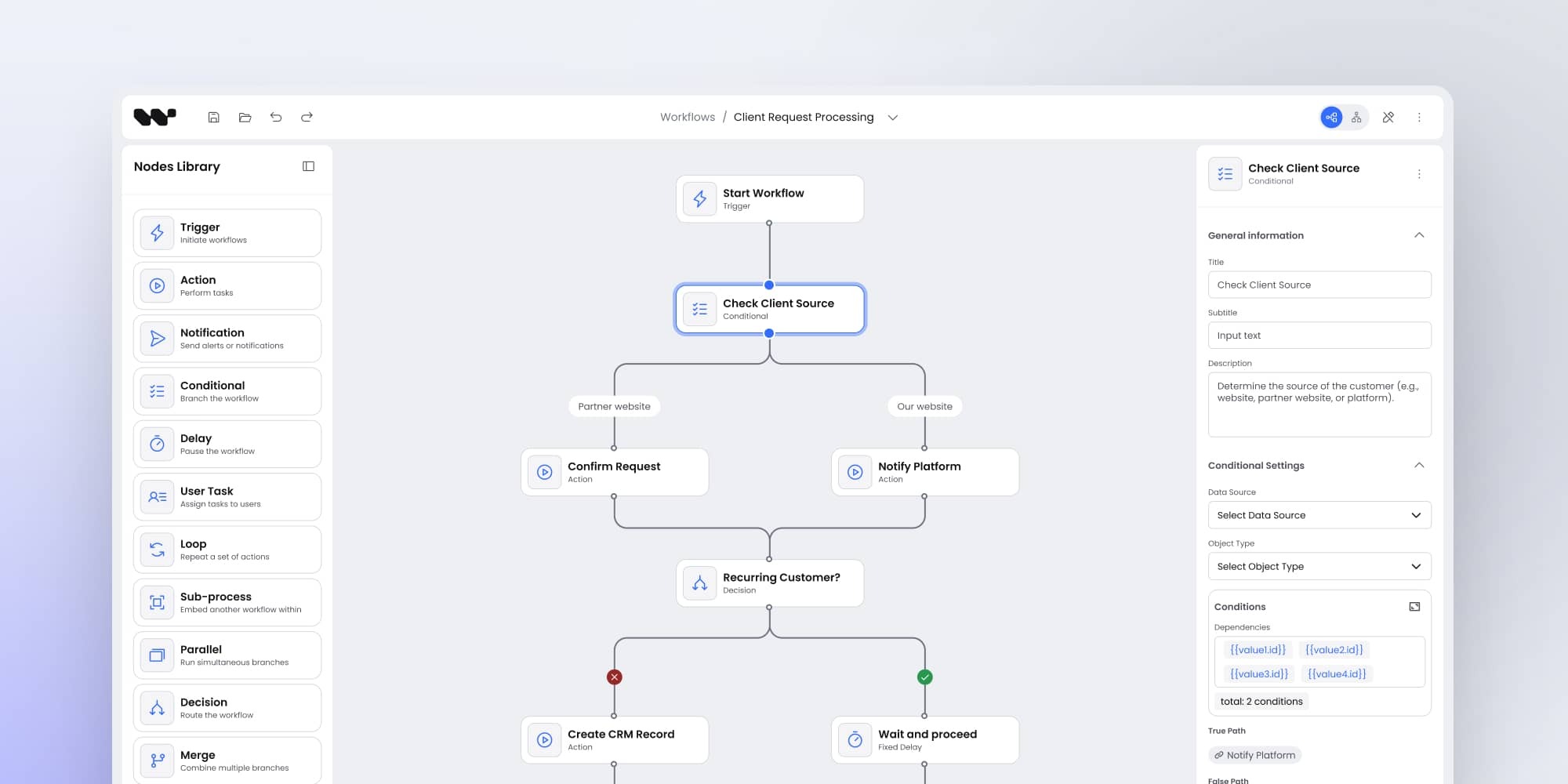
However, these features relate only to interactive diagrams. Thanks to them, users can manually and on their own create symbolic representations of processes and structures using different elements, such as nodes, arrows, links, pools, etc. Interactivity means that:
- users can create or adjust diagrams and observe how processes work,
- diagrams components inform what is going on within processes.
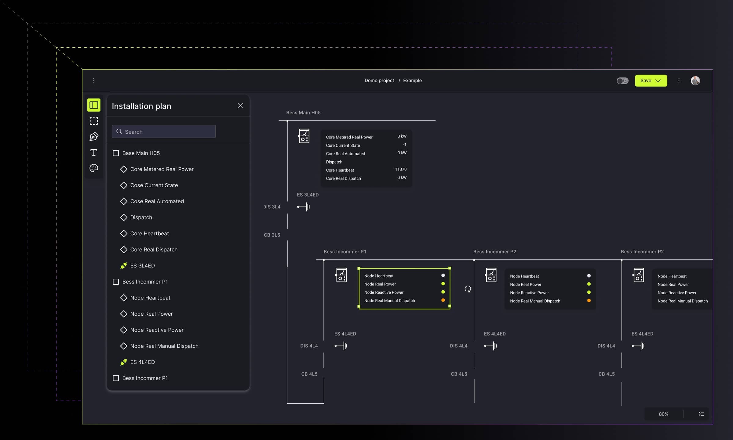
In other words, interactive data visualization provides users with more extensive control over process depiction, regardless of industry. Interactive diagrams incorporate features like clickable components, hover effects, zoom/pan functions, and layered details to empower users to reveal details on demand. They can personally explore diagrams instead of just reading them passively.
Why do modern industries need interactive diagrams?
You already know some essential benefits that diagrams offer for a business. Now, let's broaden this topic and find out why modern industries should use interactive diagrams.
Simulations management
The most effective way to test the operation of a tool or a system is through simulations. Interactive elements help in conducting them and recognizing any errors in system functioning.
There are two cases when you can use simulations:
- Dealing with complex scenarios that include a significant number of probabilistic events. This is when the user cares about corrective and preventive maintenance, inspections, and imperfect repairs.
- Implementing analytical solutions for complex systems enables users to observe the entire system, monitor its operation, and prevent failures that can negatively impact the actions performed.
Let's learn how to use interactive diagrams in simulations.
Business refinements
Most companies and corporations work with a large amount of numerical data. Thus, diagrams naturally match with business because they help in cleaning and presenting data in an easy-to-read way. Custom business diagrams enable:
- Keeping up with the market because they can act as notification tools, detecting and highlighting the most crucial data
- Planning because diagrams, as a visualization tool, allow concluding further expansion
- Collaboration because custom diagramming applications support the mutual cooperation between teams
Above, we mentioned only three benefits that custom diagrams offer for business. Learn the rest of them and get to know specific types of custom business diagrams. You might also be curious about examples of interactive diagrams usage for business.
Workflow depictions
Workflow diagrams can help monitor and improve teams' processes because they enable team members to understand critical stages in their tasks and indicate their position in a project. They listed tasks that should be taken to achieve a particular result. That's why they are helpful in projects that involve a series of actions.
As for benefits, workflow diagrams:
- accelerate the project's result delivery because they remind team members to perform particular actions or steps depicted in the diagram,
- care about quality assurance, primarily when teams deal with repeated tasks – diagrams can ensure that they follow the same steps every time,
- boost workplace satisfaction because they provide employees with clear expectations for each stage of a work task.
Diagrams in the gas and oil industry
Gas and oil are a branch of industry where process flow diagrams find wide applications. They provide engineers with many features that indicate the general flow of, e.g., a plant process stream. They are also beneficial for designing petroleum refineries, chemical and natural gas processing plants, and other industrial facilities. On the other hand, P&ID diagrams also find wide applications within the gas and oil industry. They enable the creation of networks and diagrams depicting arrangements of pipes.
Diagrams in the automotive industry
Diagrams support the process of building automotive products. They help teams in work performance because they simplify the workflow. Data visualization offers intelligent tools such as decision flow diagrams or action lists that allow administrators and other team members to exchange precise information and organize the hierarchy of tasks.

Diagrams in cybersecurity
Diagrams can be beneficial in the creation of applications for networks and software security. Their features can visually reflect the network's structure and all actions undertaken to protect network security from cyber-attacks. Diagrams enable placing even thousands of pages on them, creating the site map, and preparing the categorization of websites. Thanks to these, they help immediately indicate potential threats.

Diagrams in the aviation industry
Innovative solutions make the usage of data visualization even for aviation. Thanks to applications that use diagrams, airports can smoothly track human clusters in real time via reading data from IoT sensors and prevent overcrowding in specific areas. In addition, flow simulations dedicated to aviation enable a high-level view of the entire facility or halls, and observing individual rooms.

Diagrams in manufacturing
Various diagrams find applications in smart solutions for manufacturing or, more specifically, designing production lines and collecting live data from IoT sensors. Furthermore, intelligent solutions configure different parameters such as location, sensor range, or data type. Interactive elements in diagrams inform of any alerts in real-time, so users can react quickly and prevent the issues.

Diagrams in chatbots and conversational platforms
The chatbot platformsmarket is one of the most competitive, and this is an excellent reason to take care of its features and user experience. This branch of business is another place where diagrams can help effectively. Interactive diagrams support chatbot designers in defining the general flow of conversation. They provide designers with a full view of the flow structure. Thanks to that, users can easily spot the missing flow elements and correct the issue. The visual solution that uses interactive diagrams also depicts documenting, studying, planning, improving, or communicating the operations.

Diagrams in data analysis
Since modern business organizations deal with a large amount of valuable data regularly, diagrams are here to help in managing it. Thanks to apps that use visual components for data mining, analysts can flick through datasets and source valuable data in the shortest possible delivery time. Interactive diagrams enable organizing and cleaning data, which simplifies data mining.
Types of interactive diagrams
As for diagram types, there are plenty of them depending on modeling languages (BPMN or UML) because they offer specific elements and symbols to build diagramming structures. But that's not all. You can also encounter some characteristic diagrams that do not belong to these two languages.
As if all that weren't enough, diagrams are often perceived as a collective term consisting of a whole class of tools to visualize data. Consequently, it is common to include such visual structures as charts or graphs within this term. However, in this article, let's focus only on diagrams' narrow and specific meaning. Below you can find the most commonly used types of diagrams.
P&ID (Piping and Instrumentation Diagram)
P&ID is a specific diagram used in process engineering to depict all details of the chemical process at oil refineries, pharmaceutical manufacturers, and other processing plants where raw materials are turned into ingredients or finished products.
P&ID diagrams include all the details about components used in material processing, e.g., turbines, fans, pumps, flanges, valves, indicators, alarms, and interlocks. Moreover, they can specify those different components' parameters and the processed material flowing along the pipelines.

Planogram
A planogram is a type of diagram that finds application in retail. Its primary role is to plan how to present products on the shelves in retail shops or where to locate specific areas in a store, for example, the cooler or the grocery sections. In other words, planograms are used to boost sales results by increasing the shop clients' experience and comfort and minimizing waste for store owners and product manufacturers.
.jpg)
Mind map
Mind maps are used to organize information and show relationships between them. They consist of a central, single notion connected with many other sub-ideas. Consequently, mind maps are a great tool for presentation and explaining ideas for new projects and indicate ways for development.
Mind maps can take different forms, but they are often drawn as an image in the center of a blank page connected with associated ideas represented by other symbols, images, or words. They can depict the main topic with subtopics, the main question with avenues of exploration, a project with its components or teams, etc.
Tree diagram
Although tree diagrams are similar to mind maps, what makes the difference is that the nodes are ranked or hierarchical. Consequently, the audience can notice dependencies between information, which data is hierarchically higher or more important. What is especially beneficial is that tree diagrams can easily group data into categories.
Thanks to these features, it is easy to depict dependencies among members of a work team, a hierarchy of tasks in a project, steps of conversation flow, etc.

Workflow diagram
Workflow diagrams are a visual representation of tasks and connections between them, usually with arrows, shapes, and labels. They often depict steps of a project, but can also consist of task lists that show what actions team members have to take to achieve a result. They are used mainly for spotting bottlenecks that can slow down or stop project realization. Workflowflow diagram can also visually represent all the processes that take place in a company and their order. That's why workflow diagrams are common in small, medium, and large organizations, that is, in every structure that needs to plan its actions.
Modeling languages
We have already mentioned two diagram modeling languages – UML and BPMN, so let's now look at them a little bit closer.
UML (Unified Modeling Language)
UML is a standardized modeling language representing a collection of best practices that effectively model complex structures. It finds applications in system and software development, business modeling, and other non-software systems.
UML is not a programming language but a visual language. UML diagrams portray the behavior and structure of a system and, in this way, help engineers, business owners, and system architects with modeling and designing processes or systems and analyzing as well.
UML consists of an integrated set of objects and uses associations between them to create diagrams, classified as:
- structural diagrams which capture static aspects or structure of a system (class diagrams, component diagrams, object diagrams, deployment diagrams)
- behavior diagrams which capture dynamic aspects or behavior of the system (use case diagrams, state diagrams, activity diagrams, interaction diagrams)
BPMN (Business Process Modeling Notation)
BPMN is a visual modeling language that offers multiple techniques to help lay out internal processes, get a bigger picture of how things work, or spot errors and bottlenecks. What is characteristic of BMPN is that it uses a set of symbols and its methodology to describe a process. Its primary role is to deliver a visual representation of a business process flow that can be effortlessly read by any stakeholder – no matter their area of expertise.
How to create a diagram?
Data Visualization is an umbrella term that includes many different types and tools. Some of them are easy to create, and everyone can do this using one of the online data visualization tools.
As for more advanced interactive diagrams that characterize multiple valuable features and deal with complex data, creators should take advantage of some rules, good practices, and technology while creating diagrams.
Creating diagrams – main rules
There are some main rules that you should follow to create valuable diagrams:
- Set a goal
The first step is to ask why you want to create a diagram. What is its purpose? What effect should it bring? Start off by determining what goals you want to achieve.
- Know the audience
Determine your target group – are they end-users or maybe designers who are looking for interactive diagrams to create some structures or processes? Or perhaps your diagram is going to help data analysts in performing research?
- Choose the type
The diagram's type depends on what you want to communicate to the audience. So again, determine your goal and next pick a kind that will help people see relationships, parts of the whole, distribution, and compare data points.
When you achieve the above three steps, continue following the other 10 rules to make your diagrams stand out. However, apart from rules, you can also find some practices for good diagram creation. Let's get to know what our VP of engineering says about economizing diagrams. and how it impacts readability and performance.
Which technology is used to create diagrams?
As for technology for creating diagrams, there are a lot of options. You can choose various programming languages, libraries, and frameworks depending on what type of diagrams you will build and what information they are going to present.
In our opinion, one of the most popular and accessible technologies is the JavaScript programming language and its libraries. However, we also recommend specific frameworks such as React and Angular. Let's take a closer look at these technologies.
JavaScript and its libraries
JavaScript is a scripting or programming language that provides users with more features for creating websites. It helps develop the websites and take a step further than creating a page that only displays data. JavaScript enables adding interactive or animated elements to a page or animated elements, for instance, diagrams.
To create more advanced diagrams that gather and depict complex data, developers use different libraries to make their work faster and simpler. Among various JS libraries, the one that we can recommend is GoJS. Let's look at what GoJS is and what business and technical benefits offer.
Interactive elements within diagrams allow companies to see the big picture of their processes
Good diagrams bring clarity to complex information by showing how systems work, how processes flow, and where decisions need to happen. They combine clear structure, real-time interactions, and flexible visual components, which makes them useful in industries as different as manufacturing, gas and oil, aviation, cybersecurity, retail, and data analytics.
If you understand what interactive diagrams are, where they can be used, and how their main types work, you gain a practical toolkit for mapping processes, spotting bottlenecks, running simulations, and improving planning or collaboration. And when you pair these principles with the right creation rules and technologies – from JavaScript to GoJS, React, or Angular – you can build diagrams that communicate information quickly and support better decisions.
In short, interactive diagrams matter because they turn complexity into something you can explore, understand, and act on. They help modern organizations work faster, reduce errors, and keep data accessible for everyone who relies on it.
- What are interactive diagrams?
Interactive diagrams are visuals that let users explore data, adjust elements, and reveal details on demand. They go beyond static images by enabling actions such as clicking, zooming, panning, and editing to make complex information easier to understand.
- How do interactive diagrams differ from charts and graphs?
Charts and graphs show numerical relationships or comparisons, while diagrams illustrate how systems work, how processes flow, or how elements relate to each other. Interactive diagrams extend this by allowing users to interact with the structure directly – not just view it.
- Which industries benefit most from interactive diagrams?
Industries such as gas and oil, manufacturing, aviation, automotive, cybersecurity, and retail rely on interactive diagrams to map processes, run simulations, visualize workflows, and improve operational decisions. But their value extends far beyond these sectors. Any industry that handles complex systems or large datasets – including logistics, healthcare, finance, telecommunications, public services, and education – can use interactive diagrams to present information clearly, improve transparency, and support faster, more informed decision-making.
- What technologies are commonly used to build interactive diagrams?
Interactive diagrams are often built with JavaScript and libraries such as GoJS or with frameworks like React and Angular. These technologies enable dynamic visuals, real-time updates, and flexible interactions.
- How do interactive diagrams support business decision-making?
They simplify complex processes, highlight bottlenecks, present real-time system data, and support simulations. This helps teams make faster decisions, plan more effectively, and collaborate with greater clarity.
- Does Synergy Codes offer tools or solutions for interactive diagrams?
Yes – Synergy Codes provides dedicated solutions for building interactive diagram applications, including Workflow Builder, a no-code platform that lets teams design, test, and optimize process flows using dynamic, customizable components. It helps accelerate development and ensures clarity across complex workflows.
Data analyst with experience in reporting for marketing and sales departments. My professional goal is to grow as a data analyst, combining technical expertise with an analytical mindset to help companies make better, data-driven decisions.

Find how we can help you enhance your software and win more deals
Contact us to discuss your project. After you submit the form, we’ll get in touch with you within 48 hours to arrange a call.