Building usable and accessible diagrams with React Flow [EBOOK]

Build interactive, accessible, and intuitive diagrams with React Flow. Discover UX challenges and practical solutions for inclusive diagramming tools.

Accessible diagrams with React Flow
Diagrams are a powerful way to visualize data and processes. They help users quickly understand complex structures and relationships. Modern apps use diagram-based interfaces in everything from workflow tools to automation platforms and data modeling. However, just showing information visually doesn’t guarantee a good experience. To make diagrams truly effective, you need strong UX – intuitive, accessible, and usable by everyone.
React Flow is one of the most popular libraries for building interactive diagrams in web apps. It’s flexible and packed with useful features. Moreover, designing with users in mind takes more than just using the tool. It means solving lots of UX challenges around layout, interaction, and accessibility – especially if you want to meet WCAG standards.
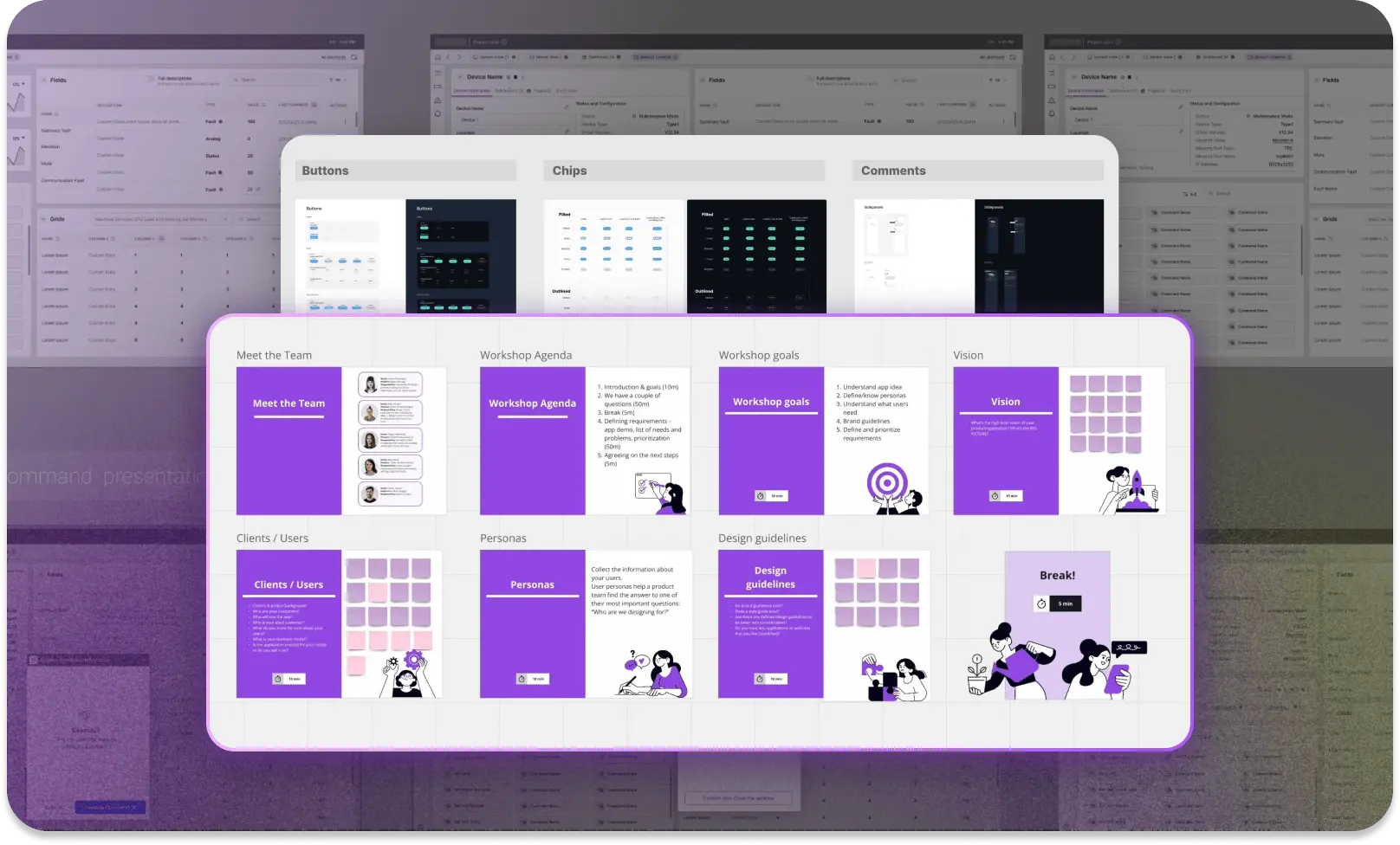
Learn how to design accessible diagrams with React Flow. Download the ebook for practical tips and solutions
Get your copy.png)
Accessibility (a11y) and keyboard navigation
Interactive diagrams play a key role in visualizing complex processes and relationships – especially in automation systems, data analysis tools, software engineering platforms, and industrial SCADA systems. But because diagrams are dynamic and mostly visual, they can be hard to use for people who rely on assistive technologies like screen readers – or for users with limited mobility who navigate by keyboard instead of a mouse.
Challenges faced by users with limited mobility
React Flow is one of the leading libraries for building diagram interfaces in the React ecosystem. It includes basic keyboard navigation and partial ARIA support. Full accessibility depends on how the app itself is built – especially when it comes to node content. Since nodes are usually custom React components, they need to be made accessible individually.
One of the main challenges is the lack of a universal standard for keyboard navigation in diagrams. It largely depends on how the diagram is used. In some cases, users tab through elements as if navigating a form. In others, the diagram is treated like a grid, following WAI-ARIA practices. Because of that, the default navigation model in React Flow is often insufficient for apps with more advanced accessibility needs.
Digital accessibility is no longer just a best practice. In many regions, it's required by law. While most legal standards are based on WCAG, each country may apply its own interpretation or additional rules.
What they all have in common is the focus on users with limited mobility – people who can’t easily use a mouse and rely on keyboard input instead. These guidelines highlight the need for fully functional keyboard interfaces, with logical tab order, visible focus states, and intuitive shortcuts. The Home Office Design System is a great resource here, offering practical examples and implementation tips.
It’s also important to remember that keyboard accessibility isn’t just for people with disabilities. Many users – like developers – simply prefer using a keyboard because it’s faster and fits the way they work.

Visual perception challenges and screen readers
Blind and low-vision users rely on screen readers, which turn visual content into linear, text-based information. Standard diagrams built with SVG or HTML elements can be detected by screen readers, but without proper semantic labels, their structure and meaning are often lost. This creates serious barriers to understanding how elements in a diagram relate to each other.
Common accessibility issues in React Flow diagrams:
- No logical focus order – Keyboard users can’t move through diagram elements in a way that reflects the information flow.
- Missing ARIA descriptions – Screen readers can’t interpret nodes and edges as a connected structure.
- Complex navigation – There’s no alternative way to explore the diagram as text – for example, as a table or hierarchical list.
A study Understanding Screen-Reader Users’ Experiences with Online Data Visualizations found that screen reader users interpret data visualizations with 61.48% less accuracy compared to sighted users. They also spend 211% more time interacting with charts – a clear sign that current tools aren't built with them in mind.
Strategies for improving accessibility in React Flow
To make diagrams more accessible and WCAG 2.1 compliant, it's important to focus on three key strategies:
1. Full keyboard support – enabling logical navigation across nodes and edges
Keyboard accessibility should be based on logical and predictable navigation that allows the user to move between diagram elements consistently.
UX principles for keyboard navigation:
- Focus visibility on interactive elements – Users should always know where they are within the diagram and which element is currently selected. This requires clearly designed ‘focus states’ that consider possible visual impairments, e.g., difficulty distinguishing colors or differences between them.
- Logical tab order that matches data flow – Users should be able to move through diagram elements in a way that reflects the diagram’s layout, e.g., left to right in a process diagram.
- Keyboard-controlled interactions – Users should be able to edit, move, connect, and delete nodes using intuitive keyboard shortcuts. These shortcuts should be easy to access, compatible with screen readers, and not interfere with regular app usage.
Despite improvements in user interface accessibility, most modern diagramming and flowchart tools still don’t offer full keyboard-only control. Apps like Whimsical, Miro, Lucidchart, and many others support a wide range of keyboard shortcuts for adding and connecting elements and basic navigation. However, they still fall short when it comes to fully managing diagram creation and editing without a mouse.
For example, users can usually insert nodes and move between them using the keyboard, but advanced actions – like opening context menus, selecting custom shapes, or managing relationships between elements – often require a pointer. These limitations not only reduce efficiency for users who prefer keyboard navigation but also create serious accessibility barriers for people with motor impairments. That’s why keyboard support in diagramming tools needs to go further – enabling full control over creation, editing, and navigation without relying solely on a mouse.
2. Semantic ARIA labels – improving diagram readability for assistive technologies
To help screen reader users understand the structure of a diagram, it’s essential to define what each element means and how everything is connected.
UX principles for using ARIA in diagrams:
- Each node should have a unique ARIA label – e.g., ‘Node A1: Data processing, connected to Start node.’
- Connections should be interpreted as relationships – e.g., ‘Connection: Start → Processing → End.’
- Group nodes into logical sections – Use ARIA roles to improve how screen readers interpret its structure, e.g.,
role="application", role="list", role="tree".
Multiple reports and studies prove that websites are becoming more complex – and the number of accessibility errors is growing. Although ARIA has the potential to improve accessibility, incorrect implementation can actually cause more issues than not using it at all. This highlights the importance of developer education and the use of native HTML elements wherever possible.
One statistic from The WebAIM Million 2024 report reveals that researchers found an average of 89,050,856 ARIA attributes – that’s 89 per page! ARIA usage increased by 15% in just one year and has grown more than fourfold since 2019.
This graph shows the number of ARIA attributes per homepage over time:

The report indicated that 74.6% of one million analyzed homepages utilized ARIA.
Pages that included ARIA had, on average, 34.2% more accessibility errors compared to those that didn’t.
The increased use of ARIA was directly linked to more issues being detected. The more ARIA attributes a page had, the more accessibility problems were found.
This doesn't mean that ARIA itself causes errors; it's the poor implementation that can easily backfire and create barriers instead of removing them.
What’s more important than adding ARIA is using proper semantic HTML tags whenever possible. ARIA should only be used when there's no native HTML alternative – for example, when displaying real-time data or notifying users about events happening elsewhere in a diagram.
3. Alternative ways to interpret a diagram – giving users access to structured data by lists or text hierarchy
Because diagrams are primarily relational structures, it’s important to offer users alternative ways to explore them – ways that don’t rely on visuals alone. This allows people to understand relationships between elements even if they can’t see or interact with the graphical layout.
UX approach to alternative diagram views:
- A list or table view of nodes and connections – Enables users to scan the diagram’s structure in a hierarchical or sequence format.
- Flexible layout options – The diagram layout should match the types of relationships between elements. Users should be able to switch between preset layouts to better meet their needs and analysis context.
- Exporting the diagram structure to accessible formats (e.g., JSON, CSV) – Allows assistive tools to process the diagram in a more structured, readable way.
One of the best-known examples of this approach is IBM Carbon Charts, which combines interactive visuals with full access to data in table form, text descriptions, and code.

Read the full version
Fill the form below to get an e-book where you'll find the full version of this guide with additional information on:
- Drag-and-drop UX
- Styling and visual customization
- Managing responsiveness and scaling
- Performance with a large number of elements
- Clarity and structure of the diagram (UX) vs. the complexity of edge routing logic (technology)
UX and Product Designer blending artistic vision with technical expertise and a research-driven mindset. Łukasz designs inclusive, accessible digital products where aesthetics meet functionality. He is passionate about cognitive psychology and how accessibility shapes user experience. In his work, he combines empathy, behavioral analysis, and attention to detail to create interfaces that support diverse user needs.

Find how we can help you enhance your software and win more deals
Contact us to discuss your project. After you submit the form, we’ll get in touch with you within 48 hours to arrange a call.