Seven great examples of custom diagrams and graphs usage for business

Explore seven real-life uses of custom diagrams and graphs in business, from streamlining decision-making to improving productivity and error prevention.

Custom diagrams and graphs help businesses turn raw data into clear visuals that improve decisions, reveal hidden relationships, and reduce errors. These seven real-life examples show how interactive, well-designed diagrams simplify complex information and strengthen everyday operations.
Data is a constant element of business. Presenting data via custom diagrams and graphs, they become a source of knowledge by clear visual representation. What is more, they change into a powerful analytical tool that has a huge impact on the functioning of the business. The diagrams and graphs themselves provide the basis for well-presented data, its understanding, and use.
Create advanced custom diagrams with expert JavaScript developers
Start now.png)
To represent data in a simple way, many companies reach for different examples of diagrams. Learn seven unusual diagram examples of the real-life use cases of custom diagrams and graphs in business.
Diagrams and graphs differences
But before we get to the icing on the cake, it's worth knowing the fundamental difference between diagrams and graphs.
What are diagrams?
Diagrams are a visual form for presenting statistical data for highlighting the basic facts and relationships that are inherent in the data. They attract attention, being, at the same time, a quicker way of grasping the results. They work well when you want to explain qualitative data, complex ideas, and loads of information without overwhelming your audience.
Common types of diagrams
Popular diagram types include fishbone diagrams, circle diagrams, tree diagrams, Venn diagrams, SWOT diagrams, or swimlane diagrams, each helping you focus on a central idea.
What are graphs?
The quantitative data is usually represented by graphs. Being less attractive than diagrams and hard to understand by a layman, the classification and tabulation techniques will reduce the complexity of presenting the data using graphs. Graphs help teams visualize numerical data such as trends over time, often through line graphs or bar graphs.
Diagrams and graphs in data visualization
Because businesses handle complex processes, the right graph or diagram type makes it easier to keep track of internal and external factors that shape decisions.
Both the diagram and graphs work well in business in areas such as:
- Streamlining decision-making processes at every stage of project development,
- Creating data analyses and selecting such information areas that are the most important at a given stage of the project,
- Sealing processes for errors that can lead to unnecessary financial and time losses.
As you can see, the use of diagrams and graphs in business has several important justifications. We have already written about diagrams in extensive material. We suggest you read this article for a more in-depth look at the characteristics of each example. But how are they used in projects?
If you want to dive deeper into the topic of differences between diagrams and graphs, read Chart vs table vs graph: which one to use and when?
Transform complex business data into clear interactive visualizations
Learn more Seven types of diagrams: Advanced custom diagrams and graphs use cases for business
The use of custom diagrams and graphs in business doesn't focus only on the attractive graphical presentation of data and easier understanding of the relationships between them.
Visual data representation supported by the appropriate UX, with the usage of applicable visual libraries, results in obtaining simplicity and an accurate understanding of data operation for business purposes.
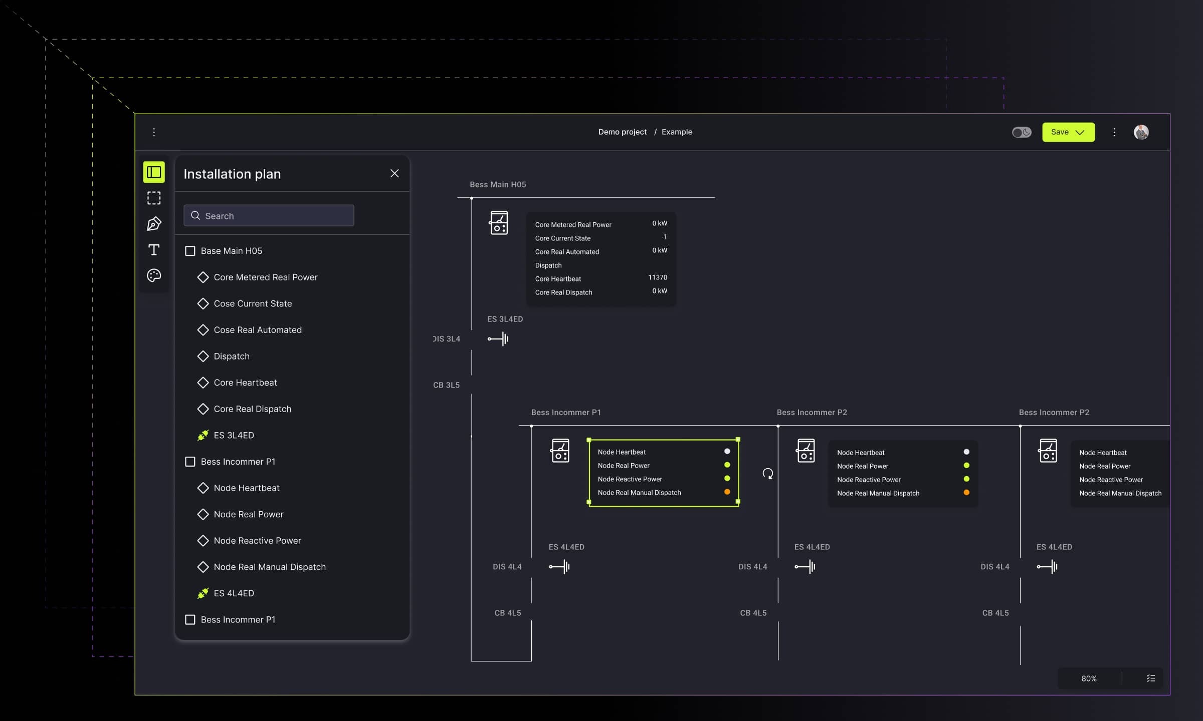
1. Business process and information flow diagram type
Turning complex processes into interactive visualization with custom diagrams and charts enables enterprise-level companies to deal with a large amount of information and processes that need to be planned, managed, and controlled. The solution presented below captures the details of the tasks and interactions with a process and augments the business process model with the corresponding information flow.
Main diagram and graphs features include:
- The helicopter view of the company.
- Breaking the multi-level nesting of nodes into subsequent sections, until the visibility of several thousand objects. Moreover, the expanding node disappears, making room to show under the structures.
- The Gantt chart view, in which the user assigns people whose image is displayed on bars to tasks.
- The mini-map – a useful preview of the entire chart.
Choosing the right diagram helps you visualize business processes and highlight different components of the workflow without overwhelming users.


→ Check Synergy Codes' examples of diagrams within business processes and information flow.
2. Digital flow simulation
The future belongs to IoT solutions. The tool presented below integrates data from sensors via interactive diagrams and charts. It illustrates the information flow and interprets it in real-time.
By enabling presenting data in various ways, i.e., using different types of charts and diagrams, the user can use the data to understand the interrelations. The main goal is to present data attractively and impressively, i.e., using visualization techniques supported by suitable visual libraries.
As IoT sensors gather thousands of data bits, the diagrams and charts enable readable data consumption as they visually highlight the most important actions. By simplifying complexity and depicting the characteristics of data, the user can utilize the information quickly, without specific technical knowledge.
The digital flow simulation diagram’s characteristics are:
- Real-time flow focuses on gathering and transforming data into a readable and digestible way.
- Presenting data in the interactive dashboard filled with various live diagrams and charts.
- Planning and executing activities via gathered and displayed data.
- Scanning the real-time activities and creating reports based on gathered information.

In complex system monitoring, simulation dashboards use a combination of chart types. While pie or funnel charts help illustrate distribution and process stages, stacked bar or line charts reveal relationships and trends between measured signals.

→ Check Synergy Codes' airport passenger flow simulation on Dribbble.
3. Network security architecture diagram
Having a strong architecture is a foundational need for any security organization’s success. The infrastructure design tool secures and scales the enterprise software development life cycle. To enable data simplification and make it intelligible, the creator must take into consideration using specific techniques as nesting, virtualization, or adding custom links.
The solution visually reflects the network's structure and all actions that might be undertaken to ensure network security to defend itself from cyber attacks.
Within the solution for designing the architecture of the large system, the diagrams and charts play a significant role. The user can benefit from an easy-to-use drag & drop to create the desired flow diagrams. What’s even more crucial, all data is aggregated in an intuitive user interface.
The computer network security architecture diagram supports:
- An expandable diagram allows placing thousands of pages on a diagram. By collapsing the content, the user can view the site map. With a double click on a node, it breaks down into a group of related subpages.
- Data mapping via an interactive diagram enables seeing the detailed data ad hoc.
- Data modeling via highlighting and coloring the connections to inform about occurring changes within the diagram. With an additional zoom in/zoom out option, the user can see the helicopter view of the whole diagram, thus making business decisions or planning easier.


→ Check the Network security architecture diagram on Dribbble.
4. Real-time collaboration process flow diagram
Project work requires unique solutions, especially when it involves many people. In this case, the usage of process flow diagrams would support fully remote work in real-time. By creating a good flow by drag & drops the user can connect members, give roles, and submit the changes live. With ad-hoc roles' change and the alternations submission with no lags, the interactive diagrams come to life.
On the other hand, the great advantage is the possibility to model the process via interactive flowcharts.
Using process flow diagrams enables savings in time and labor by dividing work between project members and using various data sources. To make the diagram amenable for comparison, the user can benefit from various types of colorings, shapes, or links.
Such a solution supports:
- Adornments to draw attention to the drag & drop functionality. For full interactivity, the user can attach the chart to the object (node), add graphics, or rates.
- Adding comments and viewing task progress via the task performance measure. These are useful for project overview and management.
- Building the flows with customized objects and linking for better performance.


→ Check Synergy Codes' examples of diagrams for real-time collaboration.
5. Modeling process flow for data mapping
Switching from tables and spreadsheets to simple diagrams supports the industries that rely on process flows. Using the appropriate charts and diagrams surely allows for full data integration and following the interrelations, as well as bringing out the hidden data. The user is capable of mapping the processes and deciding on the flow’s next steps.
Through comparisons between data bits, the user can quickly conclude and forecast the risk, which is profitable in terms of making proper business decisions.
While using the diagrams for building the process flow, the beneficial aspects are:
- Mapping the flow via easy-to-use components such as drag&drop or interactive dashboards.
- Integrating many sources and using the collected data within one diagram with multiple objects to form the flow.
- Expandable objects with additional information.

→ Check the user flow for a call center project on Dribbble.
6. Diagrams for measuring database quality
Speaking of aggregating and data integration. Multiple databases lead to serious problems with duplicates, coupling between the applications, or security. Diagrams and charts play a significant role in combining visual data residing in different sources and providing users with a unified view of it.
The solution aggregates information from multiple data warehouses and shares a current version of it across an organization and from which all shared information will flow.
The diagrams and graphs simplify the complexity and depict the characteristics of data by presenting thousands of objects on the canvas. It then creates simplicity. The use of various types of diagrams and graphs enables presenting the gathered data in various ways.
The other worth-knowing advantages are:
- A dashboard with interactive diagrams allows for a visual representation of parameters that testify to the condition of the database. Fully customizable widgets and numerous parameters allow for a good quality assessment. Additionally, charts enable the user to compare databases with selected parameters.
- The single record view focuses on a specific record to show some details, such as time, personal and identification data, and aggregated statistics.
- Database connections are ready to use via a variety of charts and diagrams that gather the data from different sources at once.


→ Explore the database integration visual tool on Dribbble.
7. Data flow diagram
The complex systems require a visual tool to collaborate and create an ecosystem with minimal to zero knowledge of coding.
Enabling graphs and diagrams, the user can visually process the logic and define the general flow, both from the user side and the administration side as well.
Diagrams and graphs also allow for process automation, especially when the user deals with complicated process logic.
The diagrams and graphs enable drawing attention to the particular objects or parts of the project. The user can scan the details and get a better understanding.
The usage of the visual data translation brings out the following pros:
- Turning complex tables into an interactive visualization via enabling a variety of diagrams that depict the flow structure and order the complex data indigestible way.
- Improving users’ productivity thanks to building the logic data flow with the possibility of new flows’ development.
- Visualizing the flow direction via interactive linking and hidden algorithms for intuitive operations.
- Editing and building the flows via ready-to-use and customized objects.


→ See the No-code chatbot design platform on Dribbble.
Examples of diagrams for the best business data visualization
Considering the role of various custom diagrams and graphs in working with data, we cannot forget about their distinct use in building the memorizing effect. By utilizing the appropriate data visualization, the user can see the data without browsing through countless tables. Using diagrams and graphs enables understanding data and interpreting it properly.
The tools based on graphic visualization are an excellent source of business understanding, both for a manager and a technical person. We are ready to help you find your diagram and graph and prepare a tool that will support your business.
- What are the main benefits of using custom diagrams and graphs in business?
Custom diagrams and graphs turn complex data into visuals that are easier to scan, compare, and understand. They support faster decision-making, reduce errors in processes, and help teams track internal and external factors that influence business outcomes.
- How do diagrams differ from graphs in practical use?
Diagrams work best for qualitative data, showing relationships, steps, or system logic. Graphs represent quantitative data such as trends or performance metrics. Using both together provides a clearer picture of business processes.
- How can custom diagrams improve real-time collaboration?
Interactive diagrams allow teams to work on the same process or data flow simultaneously. Users can update tasks, map new logic, or adjust responsibilities in real time, which shortens feedback loops and supports distributed teams.
- Can diagrams help visualize IoT or sensor-based data?
Yes. Dashboards that combine visualizations such as line charts, stacked bar charts, heatmaps, or gauge charts make it easier to interpret thousands of data points collected from IoT devices. These visuals reveal patterns, anomalies, and actions that require attention.
- How do diagrams improve project management?
Diagrams give teams a clear view of tasks, dependencies, and timelines in one place. They simplify planning, help spot risks early, and show how responsibilities move between team members. This shared visual overview keeps everyone aligned, reduces misunderstandings, and makes it easier to track progress throughout the project.
- How can ready-made tools accelerate building custom diagrams for business use?
Ready-made platforms can significantly speed up diagram development by providing reusable components, collaboration features, and logic-building modules. For example, Workflow Builder offers customizable nodes, interactive linking, and real-time editing, making it easier to design complex flows without starting from scratch.
Content Marketing Specialist who's spent the last decade making tech topics actually readable. With an MA in Brand Communication, Ida has crafted content strategies for several IT companies. Her portfolio spans from Kubernetes tutorials to enterprise software guides, now focusing on data visualization and diagramming solutions.

Find how we can help you enhance your software and win more deals
Contact us to discuss your project. After you submit the form, we’ll get in touch with you within 48 hours to arrange a call.