What is interactive data visualization and its benefits

Explore how interactive data visualizations engage users, simplify analysis, uncover patterns, and lead to better-informed, real-time decision-making.

Interactive data visualization enables users to explore and manipulate real-time data, uncover insights faster, and better understand complex relationships. Studies show users identify patterns up to three times faster with interactive visuals, making these tools essential for modern analytics, decision-making, and data-driven workflows.
What is interactive data visualization and its benefits
Interactive visualizations are produced using data visualization tools which allow for direct modification of elements on a graphical plot. The idea is to create charts and graphs which the end-user will be able to personally explore and adjust and not just read passively. This foundation remains accurate – and in recent years, interactive data visualization has become even more essential as organizations rely on real-time signals and increasingly complex business metrics.
Essentially, interactive data visualization has an advantage over static representations of data in that it offers tools for engaging with the information shown in real time, allowing the end user to see more details, generate new insights and questions, and squeeze more juice out of the available data sets. Industry reports published between 2023 and 2024 consistently confirm that users working with interactive visuals identify patterns two to three times faster compared to those relying solely on static visualizations.
Interactive data visualization helps organizations communicate data clearly, compare trends across time, uncover insights hidden in raw data, and support informed decisions through an interactive experience tailored to the audience.
Game plan for creating interactive data visualization
When trying to develop interactive maps, charts, and graphs, there are several factors for you to consider if you want to make the project a success.
This remains true, but expectations have evolved – users increasingly expect dashboards, diagrams, and interactive charts that support continuous analysis, collaborative work, and clear data stories.
Evaluate your data foundation
First, ask yourself if you have sufficient data available to design your ideal visualization. It’s not only about volume anymore, but also timeliness, structure, and whether the data supports the key performance indicators users rely on.
Design for clarity and navigation
Second, are you capable of presenting the data in a way which makes it comprehensible and easy to navigate? Modern interactive visualizations benefit from progressive disclosure, logical grouping, responsive layouts, and the ability to explore patterns without overwhelming the viewer.
Focus on meaningful interactivity
Third, do the visual interactions you’re planning to include actually generate valuable insights one can act upon? Current UX studies highlight that meaningful interactive elements – filtering, comparison tools, drill-down paths – significantly increase user engagement and speed of analysis.
Typically, an interactive data visualization will be structured around identifying the desired goals, understanding the challenges stemming from the restrictions posed by data sets, and designing a model in which data can be quickly iterated and reviewed. This approach continues to be valid and is now strengthened by modern workflows that emphasize rapid prototyping and iterative improvements.
Once your concept takes shape, you'll move on to complex data modelling aimed at thoroughly charting every piece of data and meta-data involved. Next up is the design of the user interface and the development of core technology which can be achieved with the help of various data visualization tools, including modern JavaScript libraries and components specialized in diagramming and interactive visuals.
With these steps completed, it's time to user-test for compatibility, functionality, security, UI, and performance. Put some finishing touches by introducing any improvements that may be required and you're ready to go live with your target audience.
What are the benefits of interactive data visualization?
Interactive visualizations allow their viewers to interface with the information presented in ways not possible with static charts and maps. Interactivity is the way to go especially when dealing with complex data. This remains true, and the growing volume of enterprise data makes it even more relevant.
Identifying trends faster
Humans are way better at processing visual data than just plain text. Being able to see and directly rearrange data makes it easier to acquire information and act on it accordingly. Recent analyses show that users working with interactive dashboards complete exploratory tasks significantly faster, especially when comparing multiple metrics or time periods.
Identifying relationships more efficiently
The opportunity to focus on particular metrics allows users to discern cause-and-effect relationships throughout definable timeframes. Tools equipped with interactive elements enable viewers to isolate data points, evaluate correlations, and uncover insights that would be difficult to detect in static formats.
Valuable data storytelling
The presentation of a data story works best with humans when it's served in a clear, linear fashion. Interactive data visualization allowing you to zoom in and out, highlight relevant information, filter, and change the parameters will lead to a better understanding of the information. Modern dashboards increasingly rely on narrative sequencing and guided exploration to enhance comprehension.
Simplifying complex data
A huge data set with many interconnected pieces may at first glance look very chaotic. Adding in interactive controls like zooming and filtering will introduce the much needed order and generate valuable insights. Techniques like heat maps, overview-and-detail layouts, and multi-level structures make large datasets accessible and intuitive.
Editable data visualizations are extremely useful in that they optimize the way information is shown. Dashboards with long tables, tons of numbers and text simply aren't as practical. A chart you can engage with allows for a better understanding of whatever topic is beingpresented due to its ability to group data and create hierarchies.
Interactive data visualization – examples
Let's now have a look at some examples of data visualizations that allow their viewers to engage with them. These scenarios remain relevant and are now reinforced by widespread use of sensors, streaming data, and diagramming tools.
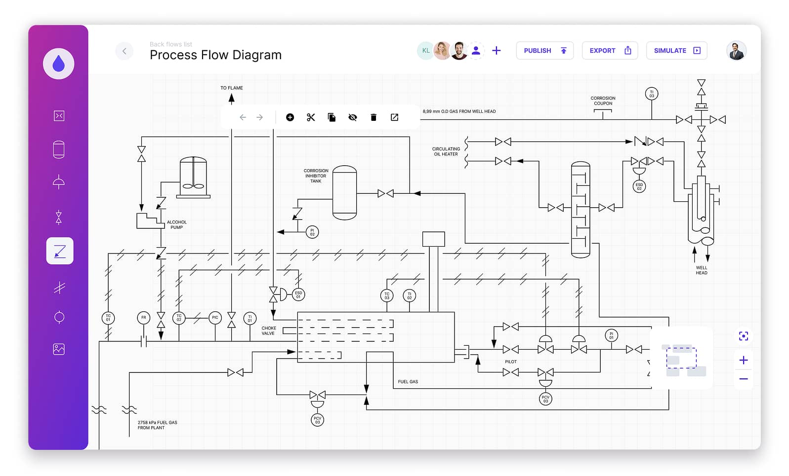
IoT and manufacturing
Applications powered by IoT enable reading data coming from sensors in real-time. This kind of tools turns the diagram into an interface which makes the user understand data flowing from various sources better. The purpose of the application is to support real-time monitoring of various data pieces, thus assessing the situation at hand. Interactive dashboards allow focusing on the current status of machines and tracking anomalies across production environments.
Smart buildings
The use of the IoT in the management of modern buildings is closely related to data visualization. It makes it possible to create interactive applications for managers, facilitators, and users to administer the available spaces via a browser or smartphone. With sensors deployed to catch up with the data flow, it's possible to get an overview of the building's conditions, check out the alerts, or schedule any necessary repairs.
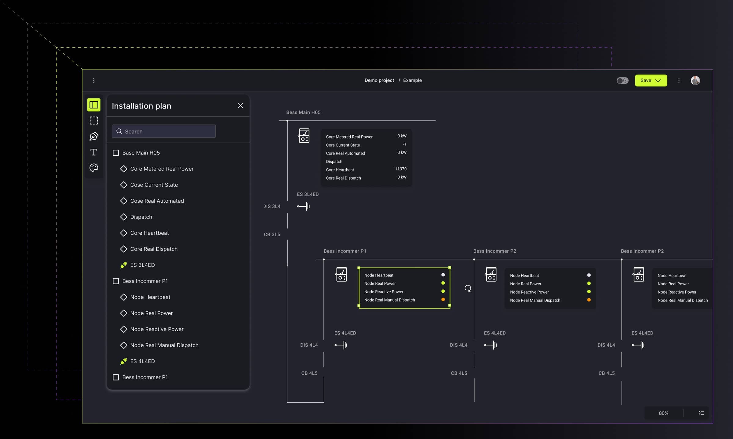
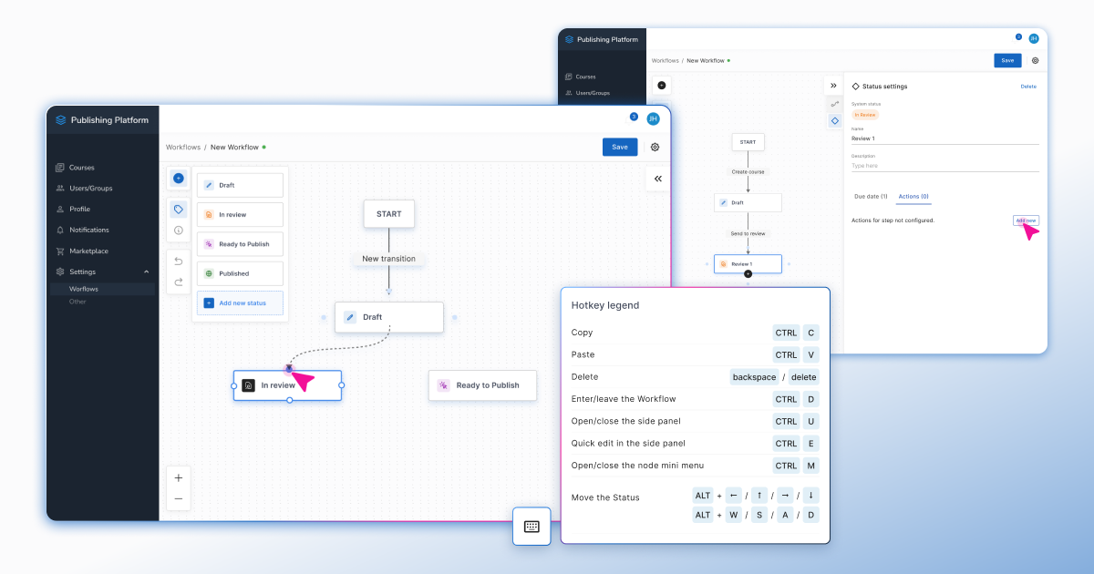
Project and workflow management
Real-time work tools for building and project management are largely based on visualization. They make it much faster to connect the work of many people, and at the same time, to understand the project and its assumptions. Thanks to visual libraries such as GoJS, it‘s possible to transfer the design and management process to the digital world.
Finance
Interactive data visualization clarifies insights through charts, graphs, and diagrams. These interactive visualizations help in making better data-driven decisions much faster. Graphs, charts and diagrams appropriately created can render large quantities of financial data. Interactive visualization helps in fast discovering not only beneficial trends but also malfunctions or frauds, empowering analysts to dive into the source of the issue and implement improvements.
What is interactive data visualization – conclusion
The use of interactive visualizations is increasing in scope across many industries and is now becoming an integral component of business intelligence and data analysis tools. What makes these interactive charts and maps so great is that they grant their viewers the opportunity to not only see but also explore, adjust and otherwise engage with the data via different actions. Perhaps the biggest boon of an interactive visualization is its ability to show the latest data which leads to well-informed and precise decisions.
At Synergy Codes, we're using extensive JavaScript libraries like GoJS to create interactive data visualizations which neaten the information and highly increase its usefulness. If you'd like to start or level up your business intelligence efforts, please contact us to discuss how we can help you achieve your goals.

- What is interactive data visualization?
Interactive data visualization is a method of presenting data through charts, diagrams, and dashboards that users can explore, filter, and adjust to reveal trends, comparisons, and insights more efficiently.
- Why is interactivity better than static charts?
Interactivity supports faster pattern recognition, easier comparison of metrics, and deeper analysis. Users can zoom, filter, and drill down to uncover insights not visible in static formats.
- Which industries benefit most from interactive data visualizations?
Industries handling complex or real-time data – such as finance, IoT, manufacturing, logistics, energy, and software development – benefit heavily due to the need for constant monitoring and rapid decision-making.
- What features make an interactive visualization effective?
Clear navigation, logical grouping, intuitive controls, meaningful filtering, and responsive layouts help users derive actionable insights with minimal cognitive load.
- How do interactive diagrams support workflow and project management?
They enable teams to map dependencies, track real-time progress, and visualize complex processes, making collaboration and issue detection significantly easier.
- Can tools like Workflow Builder support interactive data visualization?
Yes. Workflow Builder provides a visual, interactive environment for building and managing workflows, making it easier to interpret relationships, automate steps, and streamline operations.
A Content Marketing Specialist with 6 years of IT industry expertise, crafting everything from in-depth ebooks to strategic brand narratives. Weronika understands diverse tech audiences and ensures every piece delivers value in the most accessible way possible.

Find how we can help you enhance your software and win more deals
Contact us to discuss your project. After you submit the form, we’ll get in touch with you within 48 hours to arrange a call.