Visual accessibility in interactive diagram tools: a practical guide

Not all diagram users are eagle-eyed. How can you enhance your diagram app's visual accessibility?

2.2 billion people live with some visual impairment, and 1 in 12 men is color blind. To make interactive diagram tools work for them, provide enough contrast, do not rely on color alone, use icons mindfully, reduce cognitive load, and support both light and dark mode
When you work on design and diagramming apps, you might find yourself focusing on the visual representation of information and relying on visual cues such as color or shape. For many users, it's not enough. 1 in 12 men is color blind. 25% of people have age-related farsightedness. They affect how people read and work with visual information. How to enable visual accessibility in interactive diagram tools?
Note: This article focuses on perceivability achieved through visual design.
Challenges in designing interactive diagram tools
Diagrams are omnipresent in work life. They help people brainstorm, organize information, plan their work, design processes, or manage installations. Usually, when designing a diagram app, you need to cover the following scenarios:
- Reading a diagram.
- Adding a node from a library.
- Editing or deleting a node.
- Navigating across a diagram.
- Recognizing warnings.
- Comparing information.
By default, this information is conveyed by visual means. Designers use a variety of colors, patterns, and shapes to distinguish information displayed on the screen. Users need to learn what specific signifiers mean and how to understand them. Another challenge is to balance heavy data sets. It's easy to cause cognitive overwhelm by displaying too much data at once, which can be inevitable in some industries. Before diving into good practices to manage these challenges, examine users' possible needs.
Get our WCAG 2.1 checklist for accessible diagrams
Download checklist.png)
What visual impairment can mean
Visual impairment can mean completely different experiences and preferences. At least 2.2 billion people live with some visual impairment - it's a vast and very differentiated group. Some users with low vision or blindness require screen readers to read the Web. Others with farsightedness or tired eyes rely on screen zoom or bigger fonts. Color blind people use the Web with no assistive technology; however, they need specific color combinations or markers to understand the full content. Even one diagnosis can mean various experiences. For example, there are a few types of color blindness. The most common type is red-green color vision deficiency. The less common types are blue-yellow color vision deficiency and monochromacy (when people can't see colors at all).
You can never assume that people working with data visualizations or diagrams have no trouble seeing. Like any other disability, visual impairment can happen anytime. Visual acuity can differ day to day. Including these cases in your data visualization design will enhance the overall readability.
Good practices
Provide enough contrast
Even though enough contrast seems like a basic accessibility practice, still 83.9% of websites use too low text contrast. Use a contrast ratio of at least 4.5:1 for normal text and 3:1 for large text (bigger than 24 px). This is especially important for people with low vision, low contrast sensitivity, or color blindness, but will improve readability for everyone.
In my practice, I noticed that while designers remember to provide enough contrast for text, they overlook UI elements such as input field borders, checkboxes, toggle buttons, etc. All functional elements of the interface should have a 3:1 contrast ratio with adjacent colors to meet Web Content Accessibility Guidelines (WCAG) requirements. Regular button backgrounds are an exception to this rule under WCAG conformance, but you should still maintain sufficient contrast for readability.
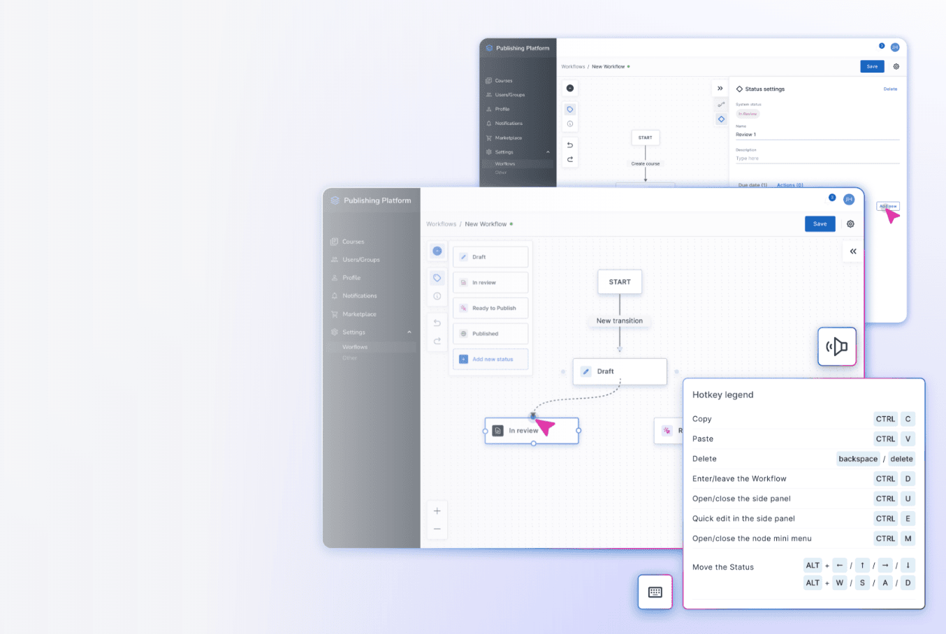
For example, MessageFlow, a visual campaign builder built for Vercom with Workflow Builder, keeps its nodes, icons, input fields, and other UI elements above minimum contrast requirements. The input fields use a light background with a single bottom border, following Google's Material Design 3 "filled" text field pattern.
%20(1).png)
Do not rely on color alone
When working with a diagram, a user needs to understand a lot of information at once. A node's type, category, or state needs to be distinguished quickly. It's tempting to use colors as meaning-markers: colorful strokes or background color differentiation. Color-only cues might work for users with typical color vision, but will be useless for people with color blindness. They also increase cognitive overload, as users need to learn what each color means and memorize it.
Instead of color-only differentiation, use more symbols: labels, patterns, or icons. Choose the solution that fits your product context.
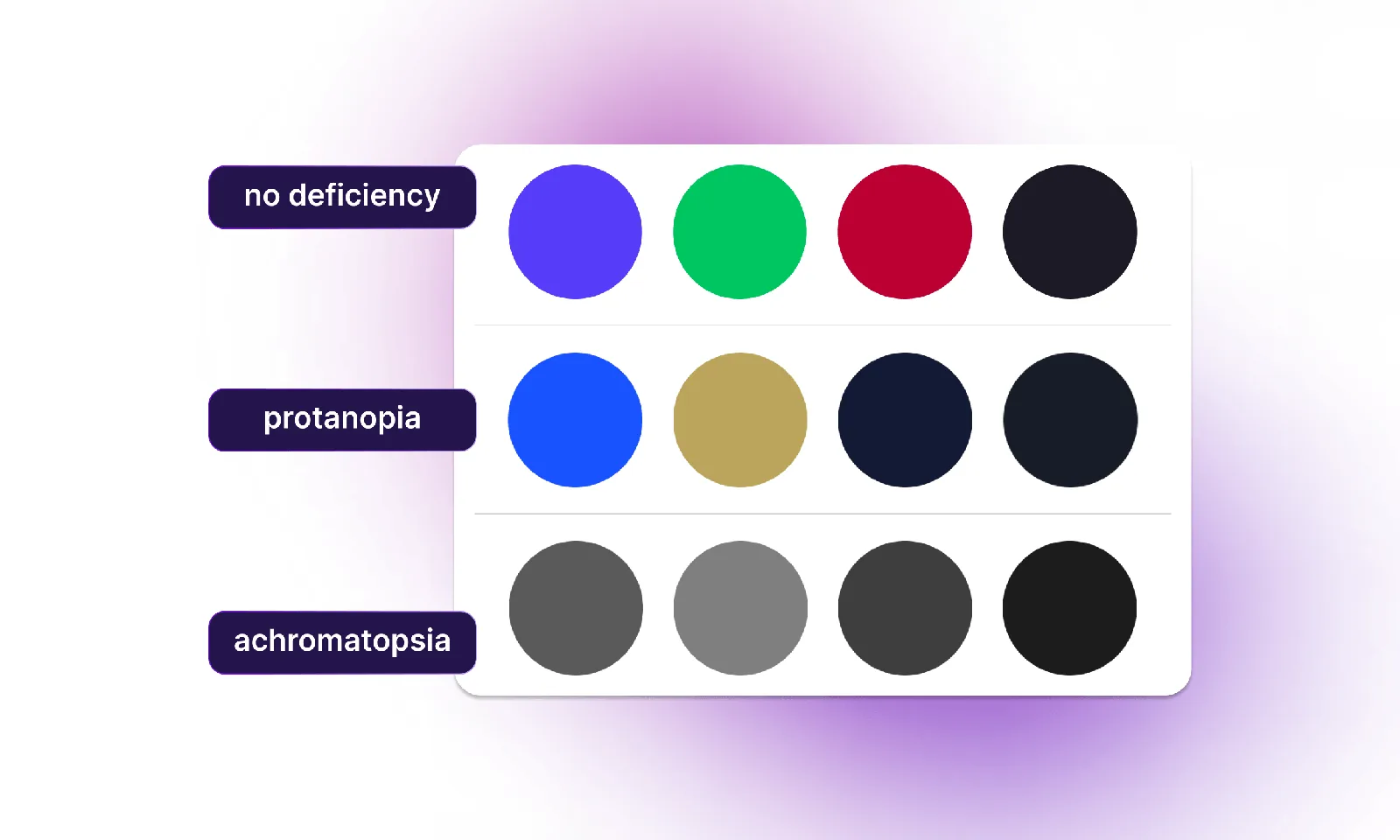
If you're using colors as a supportive element, make them colorblind-friendly. Use palettes that use shades recognizable even with color deficiency. You can use existing tools such as Atmos or Viz-Palette to generate inclusive color systems. Be careful when placing colors next to each other. These color combinations can be difficult for people with deuteranopia, protanopia, and tritanopia:
- Green and red
- Red and black
- Yellow and blue
Blue paired with orange or red is the safest pair. When using a wide range of colors, differentiate their lightness. This way they will be readable even when in grayscale.
Use icons mindfully
Icons serve to provide a quick way to understand information. According to Baymard Institute, adding icons to text labels significantly improves scannability. When working on a content-heavy app, you can use this information to make users pay attention to specific parts of the UI. It gets more tricky when more and more icons are needed to represent abstract concepts.
Kate Kaplan argues that icons' usability relies mostly on two factors: recognizability and interpretation. First, people need to identify the shape correctly. Then, they should be able to assign the proper meaning. Often the same shape is used to convey different meanings across different apps. This means that users need to learn the proper meaning in the specific context. Think about the flag icon. In Outlook, it means "flag for follow-up". In Gmail, it's "Report illegal content". In social media apps like Reddit, flag stands for "Report". In task management apps like ClickUp or Todoist, flag means "Priority".
In diagrams, icons can lose their clarity when users zoom out. For this reason, it's even more important to keep them clear and simple. Complex icons with too many details will be unrecognizable. Too small or too decorative icons won't fulfill their role. Don't include text in your icon design - if it's needed, use abstract representations like simple lines or shapes.
The most accessible way to use icons is to pair them with labels. Combining icons with text labels prevents user confusion about what each icon means. Icons should be treated as a supportive system of communication, not the primary one. Don't fall into the color-coding trap: you shouldn't use a single icon in different colors to signify different states, for reasons discussed in the previous paragraph.
Free ebook: build usable, accessible diagrams in React Flow
Get the ebookReduce cognitive load
Cognitive load means the mental effort required to understand information. It's based on working memory, which has limited capacity. Diagrams are a form of data visualization that makes new information easier to process, but they can still become complex when there's a lot of it to absorb. This is especially common in enterprise diagram tools for such industries as AV engineering, healthcare, and data processing.
Use established patterns that users are accustomed to - breaking those increases the mental load required to understand what's happening on the screen. One example of this is to use horizontal text instead of vertical.
Reduce unnecessary UI elements. Use a limited color palette and avoid purely decorative elements. Some designers and stakeholders fear white space, when in reality it improves clarity and readability. White space lets users distinguish between elements and gives designers a tool for establishing a clear visual hierarchy.
Use Gestalt principles to consciously organize information in meaningful groups. Elements that have the same role should be similar to each other. Use proximity to indicate a logical connection between pieces of information or features.
Support customization
Your app should be accessible by default. However, some users have specific preferences regarding their web setup. Your app should not overwrite users' system or browser settings, whether it's zoom level, font size, or color combination. Make sure that both your diagram and your app's UIs are readable even with 200% zoom.
Your app can also include some customization options itself. In diagrams, consider allowing users to customize edge thickness and node detail level. If your app uses motion, allow users to turn it off.
Support both light and dark mode. It's a myth that dark mode is more accessible: this depends on the user's preferences and conditions. According to Raluca Budiu of Nielsen Norman Group, light mode usually performs better for users with normal vision. People with astigmatism (1 in 3 people globally!) may experience halation when they use dark mode. This means that they perceive light text on a dark background as blurry. People with presbyopia (age-related farsightedness) also benefit from light mode. On the other hand, people with photophobia and those who suffer from migraines will benefit from dark mode. It also helps when using a computer in a dark environment.
Allow users to select their preferred mode. Their preference can change with context of use. This AV design software by Synergy Codes, for example, works well in both settings. Light mode suits a bright office, and dark mode suits a dim job site.
%20(1).png)
Guide accessible authoring
Designing diagram tools differs from designing traditional enterprise apps. In canvas-based apps, the user usually controls what's on screen. The end user creates the final diagram. This means that you need to treat interactive canvas apps like authoring tools. To ensure that the final diagram will be accessible, you need to provide users with proper accessibility tools.
If users can select colors for their nodes and edges themselves, provide them with a built-in contrast-checker. If users can add pictures, they should be able to create alt text for them.
See how we built an accessibility-first workflow builder
See case studySummary
Implementing accessibility in a diagram app is a long-term project. It requires collaboration across teams to ensure that every user flow is truly usable. Web Content Accessibility Guidelines group accessibility into four principles: perceivable, operable, understandable, and robust. The foregoing practices focus on the first, making diagrams perceivable through visual design.
- What is visual accessibility in diagram design?
Visual accessibility means designing app's content and features in a way that is accessible to user with visual impairments.
- How can I check if my diagram's UI meets contrast requirements?
Check text against a 4.5:1 contrast ratio, and large text (24 px or larger) against 3:1, per WCAG. Functional UI elements (input borders, checkboxes, toggle buttons ,and others) need at least 3:1 contrast with their surroundings too. For existing web products, use the WAVE or Axe DevTools browser extensions, or the Lighthouse panel in Chrome DevTools. When designing, you can check contrasts on the go with basic Figma features.
- Is dark mode more accessible?
It's a myth. Neither dark mode nor light mode is more accessible: this depends on the user's context and needs. For example, people with astigmatism prefer light mode, and people with photophobia prefer dark mode.
- Will accessibility slow development down?
No, not if you consider accessibility from the very start. Accessibility-first design and development save time and money compared to adding it afterward.
Senior Product Designer and Accessibility Champion at Synergy Codes. With 6+ years of designing UX, she currently focuses on leading design in diagramming and data visualization projects, combining her usability knowledge with facilitation experience. Certified Professional in Accessibility Core Competencies (CPACC) since 2025.

Find how we can help you enhance your software and win more deals
Contact us to discuss your project. After you submit the form, we’ll get in touch with you within 48 hours to arrange a call.